
Design; Colors and Trends for a New Year
Hello Everyone, here in Sioux Falls things have been in a state of deep freeze, for a couple months now (although winter has been pretty mild so far, so no complaints!) We thought in honor of the start of a new year- we would update y’all on our very own DUPERT FAMILY HOME. If you know the owners of our company: Ashley and her husband Jared (aka. “Mister Omorfia,”) then you’ve probably met at least one of their 4 beautiful daughters: Riley, Peyton, Braylin or Charley. To know the Dupert family is to know Patience, Resilience and Faithfulness in The Lord. {If you are new to these parts, you can CLICK HERE to get to know the Dupert Family, a little better!} The Dupert’s have been in this home for many LOVE FILLED years. God has provided a safe haven/shelter within these walls for their family to grow and blossom!! So now after- 12 years, 4 children (3 TEENS!), 3 dogs, 3 bedrooms, 2 bathrooms and 1 unfinished basement…. this HOME is finally getting the TLC it deserves.
*If you’re an avid follower of our Instagram Stories, you’ve seen some major progress pictures recently!! They’ve updated the ENTIRE House and we’ve got the 411 on the whole process (we’ll have a blog about the entire process, in the future!)
As if carrying an entirely new beginning with it- the New Year has rushed in like a wind. With 2020 leaving a resounding chaos in its wake, the world is struggling to find a new “normal” in all of the uncertainty… grasping at anything that remotely resembles some of the life we once had. So it is with great pleasure that we start 2021! We press on and push forward toward a fresh start with new goals, new concepts, new ways of thinking and most importantly NEW DESIGN/COLOR TRENDS!!!
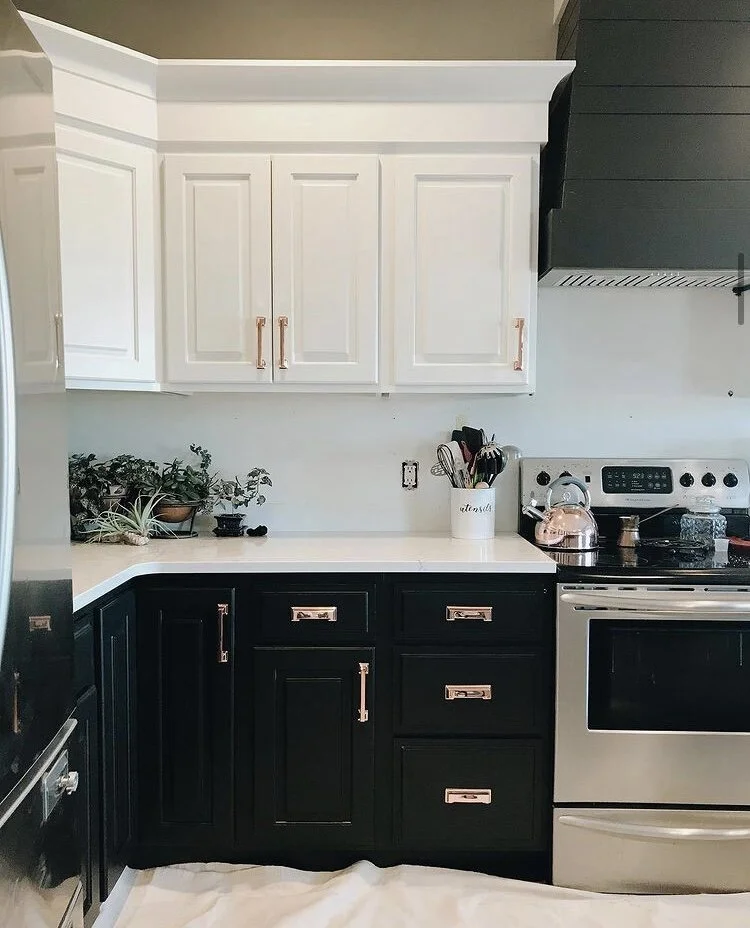
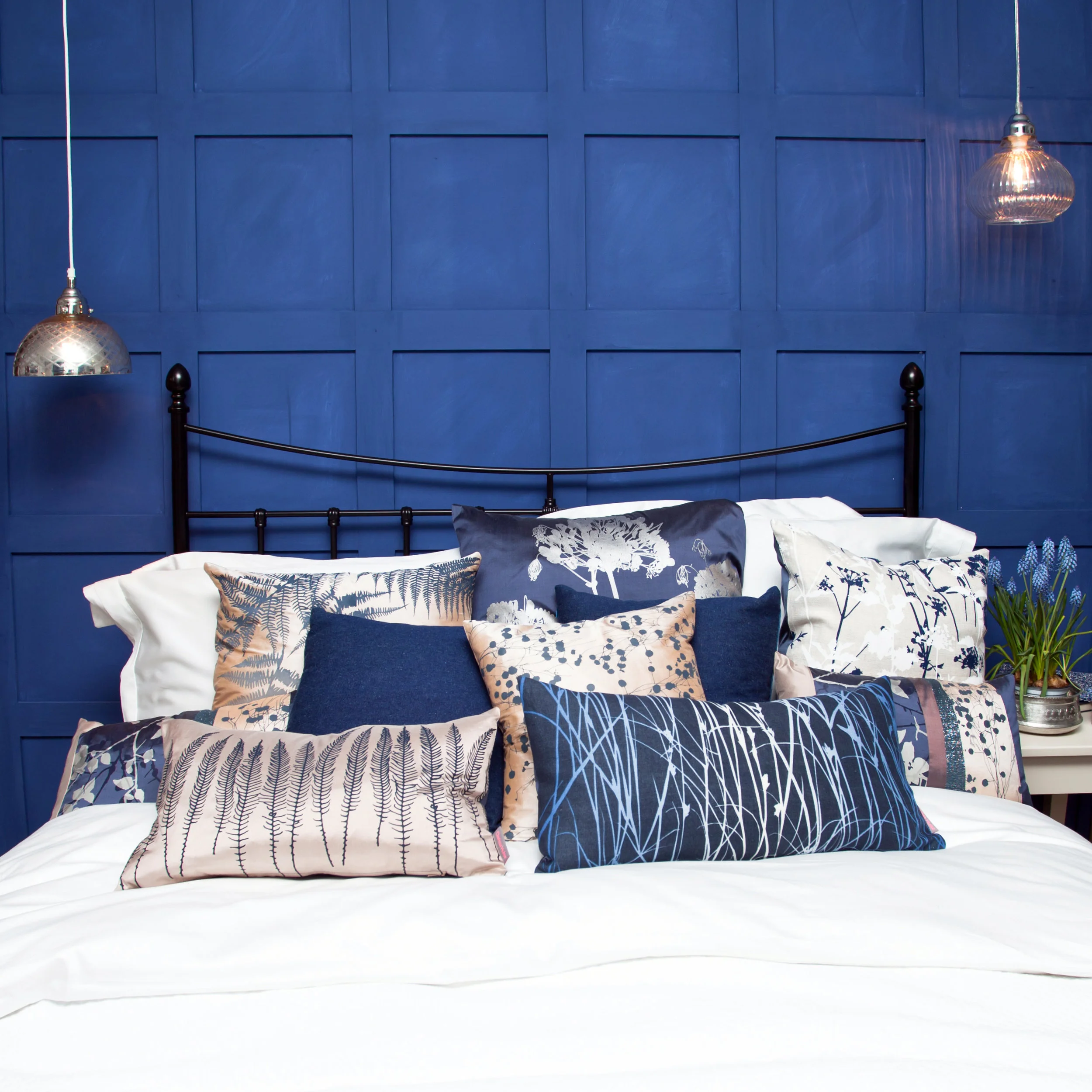
Progress on the Dupert Family Kitchen Renovation.
It has been a long standing tradition for companies to release color forecasts for the next year, pointing toward the top emerging trends for the design world. Companies like Sherwin-Williams, Behr, HGTV and Benjamin Moore have all released their own colors of the year, but none are as influential or highly anticipated as the Pantone Color of the Year. The trend analysts at Pantone Color Institute, have the thankless job of deciding the new color of the upcoming year. 2020's Classic Blue (chosen long before the year's tumultuous fate, was sealed) was all about "calm, confidence and connection.” Now, as the world has turned over a new page- Pantone has chosen two colors of the year! This is only the second time in it’s 20-year history that two shades were chosen (the first in 2016; Rose Quartz and Serenity gradient.)
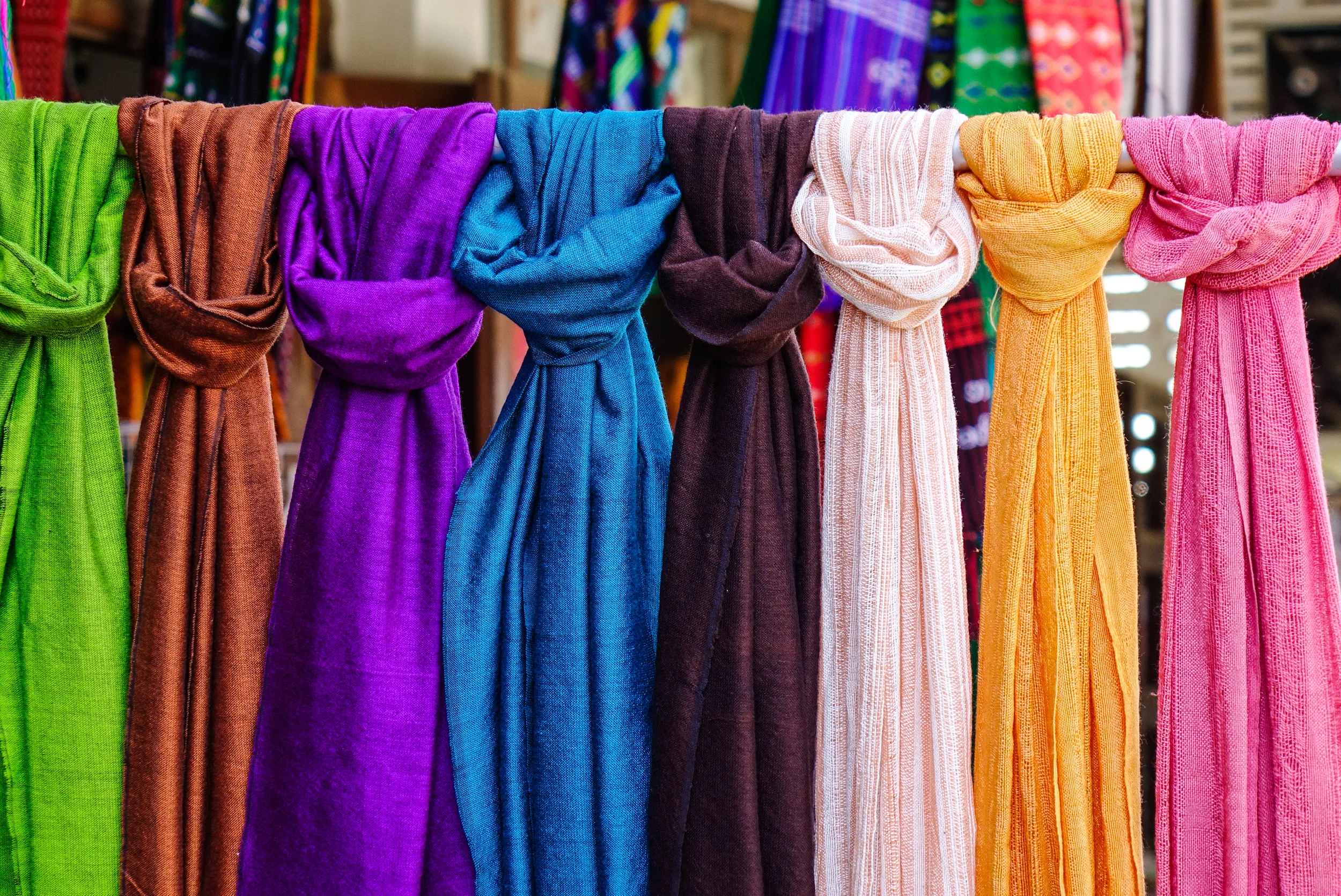
Pantone Color of the Year: ULTIMATE GRAY & ILLUMINATING
“The selection of two independent colors, highlights how different elements can come together, to express a message of strength and hopefulness- they can conveying the idea that it’s not just about one color or one person, it’s about more than one.” “The union of enduring Ultimate Gray with vibrant Yellow Illuminating, expresses a message of positivity and happiness supported by fortitude. Practical and rock solid but at the same time warming and optimistic, this is a color combination that gives us resilience and encouragement- that is essential to the human spirit,” says Leatrice Eiseman, executive director of the Pantone Color Institute.

Illuminating Yellow
Illuminating— is a lemony, cheerful hue that has a sense of delight, warmth and power. It casts light, positivity and visibility on everything in its path... similar to sunshine. Yellow is often considered the brightest and most energizing of the warm colors. It’s associated with optimism, happiness, hope, building confidence and encouraging communication. Yellow’s vivid appearance means its best used when you want to command attention so it works well as an accent color. Because of its intensity/boldness, it can effortlessly overwhelm- so it is best to use in small amounts and balance it with a subdued/basic hue. The overall vibe of your space will turn fun and moody, with the bold pop of yellow bringing energy and color throughout a neutral backdrop.
Ultimate Gray
Ultimate Gray— a neutral, generally considered on the cool end of the color spectrum. This durable shade has a deep connection to natural dependable elements (rocky cliffs, pebbles on the beach, stone formations, ancient temples and monuments) that highlights an ability to withstand the ravages of time and provide a firm foundation. Gray quietly assures encouraging feelings of composure, steadiness and resilience; it reminds us of eternal basics and balance. Since it is subdued and reserved…it can sometimes be considered conservative, moody, dull, emotionless or depressing. It’s a diplomatic color, negotiating all the distance between black and white, it is impartial- most commonly associated with neutrality, conformity, compromise and modesty. Since it is ultra-saturated, use furniture and decor that would contrast and soften the color.
Ultimate Gray and Illuminating encapsulate thoughtfulness, with the promise of something sunny and friendly.
Incorporating Color Trends into your Home
Pantone suggests “applying them in the way that they were intentionally chosen: use Ultimate Gray as your foundation and tie in bursts of Illuminating.” In design, Gray backgrounds are very common- timeless, practical and versatile; making a great canvas to a wide variety of colors. Incorporating Yellow into more muted color schemes can create a relaxing environment, uplifted by the burst of brightness. Ultimate Gray provides a firm foundation for Illuminating Yellow, that heightens awareness and enhances intuition; they increase intellectual curiosity, originality, creativity and mental resourcefulness. Even on the exterior of a home these colors can evoke the same emotions, says Pantone “Painting a front door in bright yellow Illuminating conveys a warm and welcoming message when supported by solid and dependable Ultimate Gray in the exterior finishes.” Dress up Ultimate Gray with rich neutrals like leather, dark brown woods, stark blacks/whites and some textured tans—embracing a neutral palette while creating a space with a ton of depth. Capture the energy of Illuminating, throughout your architecture by painting archways, adding wall art or accent chairs; this is a fun way to bring in a bold color that you aren’t ready to commit to on a larger scale.
*The most important thing to remember is BALANCE!

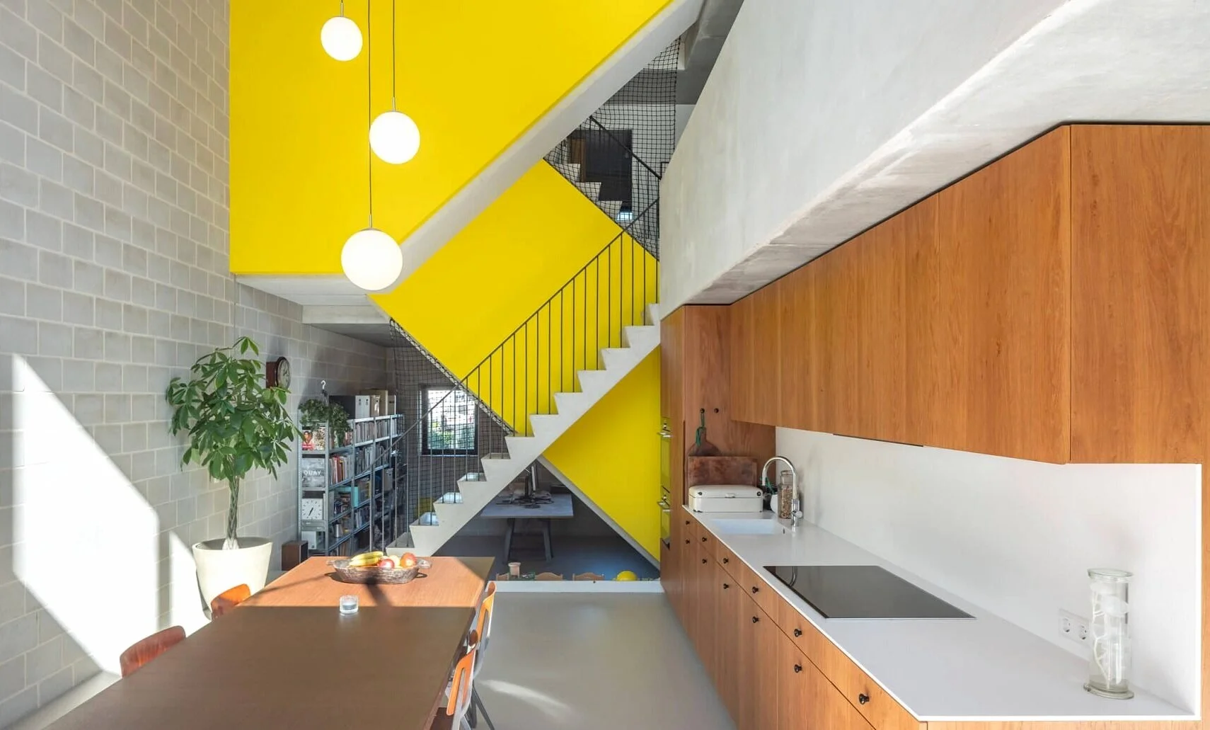
Inspiration for using your homes architecture to add a pop of color to a neutral color palette.
Design Trends on the Rise in 2021
Gray Color (and All Neutrals)- Neutrals are timeless and exciting- differing shades create a calm/serene atmosphere. Neutral colors are more effected by the colors that surround them. Neutral colors often have great versatility- serving as both, center stage or a great backdrop to base a design.
Industrial Interior Design- Generally, this trend is about incorporating unexpected materials and giving a raw, unfinished look in your interior. Key characteristics of industrial design: provide style and function, exposed ducts/pipes, wood and metal surfaces and vintage furniture/ accessories.
“Grandmillenial”- This type of interior design, brings the nostalgia! Mainstream culture might consider this traditional design “outdated” or “stuffy.” Give a 21st-century makeover, to the floral and chinoiserie-filled interiors our grandparents once enjoyed.
Vintage Style- This type of design utilizes symmetry and natural materials such as wood, stone and forged elements. Combine artificially aged décor or classic design styles from the 20th century, with new elements to create a harmonious feel without being outdated.
Houseplants or House Gardens- Houseplants/gardens create a layered space and welcome the outdoors in. Research links our natural environment to human well-being/mental health. This type of design creates connections with nature while allowing us to unwind from our tech-driven lifestyles.
Decorative Glass- A form of art that can express your feelings and create a personalized space. Adding glass to the walls or floors (glass ceilings, decorative windows, dividers, etc) comforts but also utilizes decorative elements to create an atmosphere.
Organic Products (Including Sustainable Products)- This type of design, focuses on sustainable materials/products with an emphases on functionalism. Organic design embraces green living; from furniture to fabric- you incorporate more natural characteristics!
Statement Pieces- Add character, flair, depth and personality to your space (color, artwork, furniture and lighting.) Statement pieces are pieces that- draw attention, are bold and unique from the surrounding elements and stand alone, as a point of interest.
Wild/Textured Walls- Textured walls are an artistic expression with functional purpose, as they help hide signs of drywall installation. Wall coverings (wallpaper, tapestries, etc) can simulate natural elements or give you that wild pop of character, your space is missing.
Bright, Happy and Mood Enhancing Décor- This type of design focuses on improving humans’ responses to the environments around them. Incorporating different colors, shapes, lighting and textures to create/enhance a specific mood.
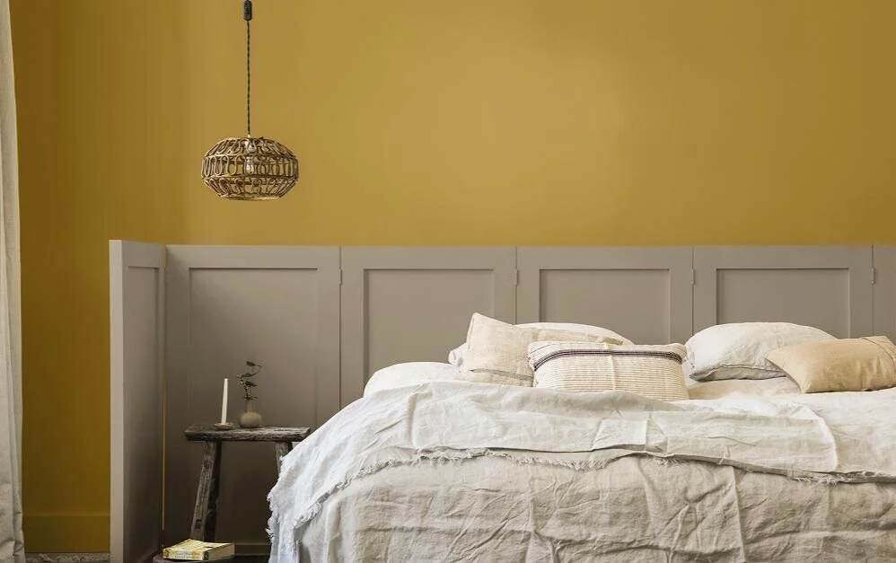
Mood Enhancing Decor: incorporates texture, shape & lighting to create the desired mood!
Our Designers want to HELP!
Here at Omorfia, our desire is to make life better and more BEAUTIFUL for you! If you’ve fallen in love with this years Pantone Colors of the Year (or any new color palette) and you want to incorporate it into your current style; but you aren’t sure how? Start by chatting with us in a FREE 30-minute phone consultation or schedule a personal {$99/2 hour} appointment with one of our designers. Call us at 605-223-0193 OR go to omorfiadesignsinc.com/getstarted
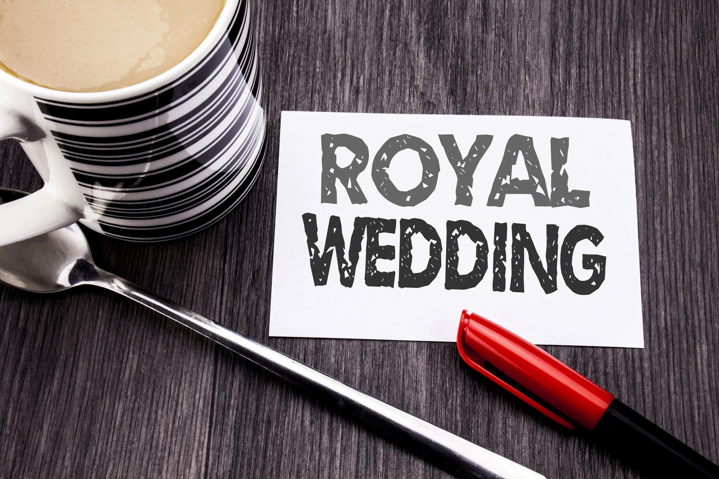
Royal Wedding Colors and U.S. Interior Design Trends Collide
Have you caught yourself watching any of the recent royal weddings? It is hard not to be at least a little bit fascinated by the lavish affairs that are generally broadcast even on our side of the pond. Between the elegant dresses, the incredible floral arrangements, the food, and of course the hats and fascinators, our screens are filled with an array of colors.
Have you caught yourself watching any of the recent royal weddings? It is hard not to be at least a little bit fascinated by the lavish affairs that are generally broadcast even on our side of the pond. Between the elegant dresses, the incredible floral arrangements, the food, and of course the hats and fascinators, our screens are filled with an array of colors.
Is our country influenced by these color choices? How did Kate Middleton’s choices of colors for her wedding affect Americans? Or how about Meghan Markle’s light green arrangements? Or even Princess Beatrice and Eugenie with Eugenie’s recent marriage.
Americans are enamored with the royal lifestyle, so it makes sense that their choices will influence us. Time and again, we have seen colors from a royal affair creep into our fashion and design world. Whatever colors are chosen to adorn the dresses and flowers at royal weddings inevitably invade our walls and wardrobes, too. The experts at Omorfia follow these trends and will help bring these colors into your home.
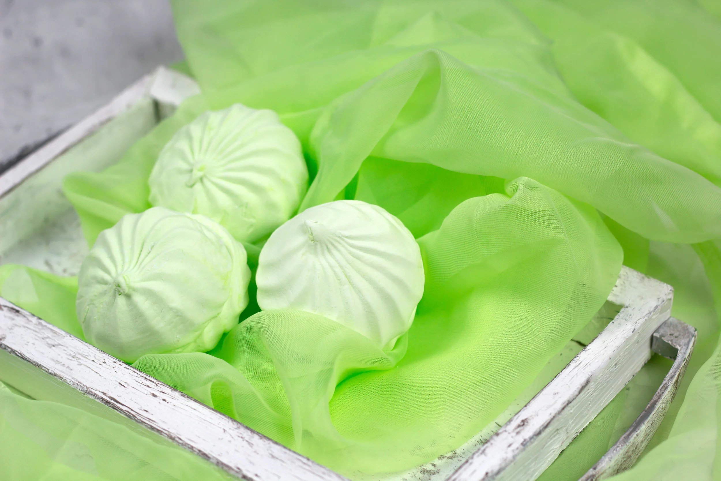
Mint Green Galore
For the 29 million Americans and 53 million people worldwide who tuned in to watch Meghan Markle and Prince Harry tie the knot, the evidence of Meghan’s favorite color was everywhere.
It is no secret Meghan Markle prefers shades of light green, in particular, mint green. It is noticeable in her clothing choices, and the incredibly popular lifestyle blog she used to run is full of her preferences for this soft color.
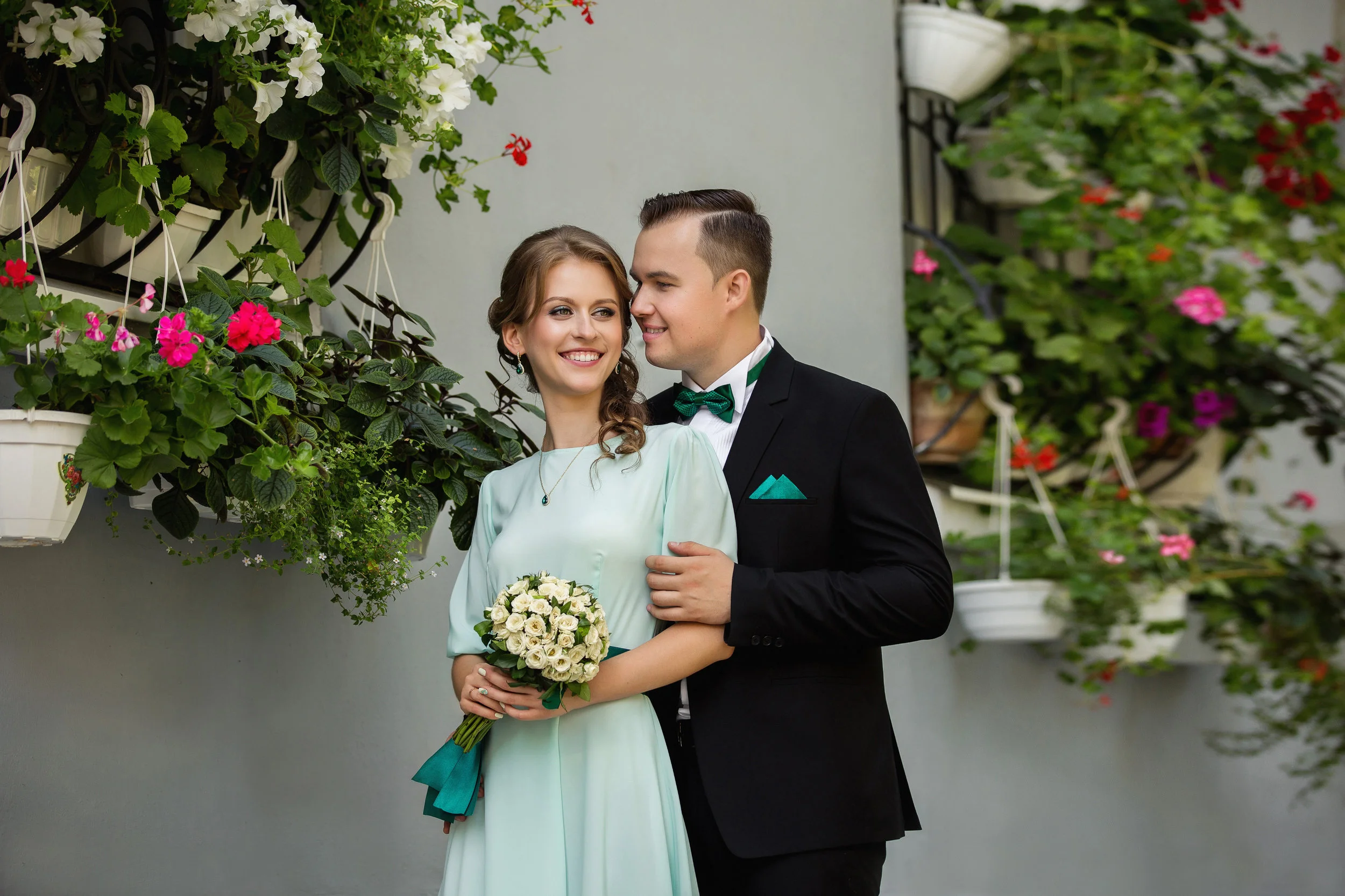
Pictures from the royal wedding in May showcase all shades of green. Meghan’s mother wore an incredible mint green dress with a matching hat and coat. The Queen herself, who is known for her love of bright colors, even wore a green jacket over her floral dress. Many of the guests were in similar shades of green. Everyone looked fabulous in this calming yet flattering color.
Since the wedding, Americans have seen a drastic rise in the color green across the board. Interior decorators are filling homes and walls with beautiful shades of green. One of the hottest colors of 2018 is light green. This color is an excellent choice because it comes in so many beautiful shades from mint to chartreuse to sage and citron.
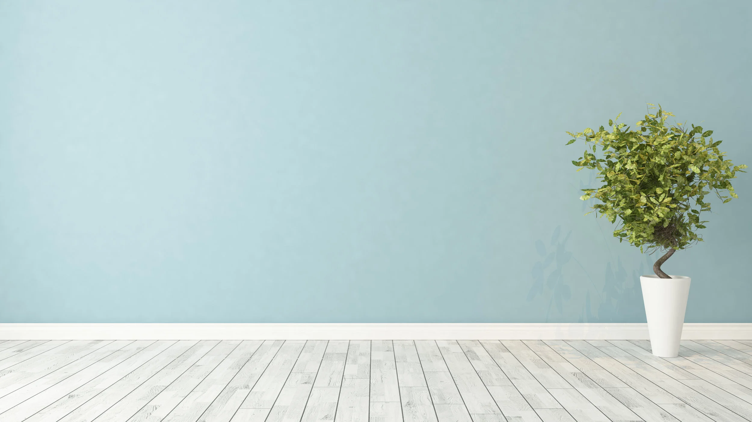
It will not be hard to find a way to incorporate light green as there is a shade for everyone. If you are looking for ways to try out light green without painting a wall or buying a new couch, try throw pillows, curtains, vases, artwork, or throw blankets on your couch. Or simply bring in a bouquet filled with soft green or even a live plant.
If you are sold on this appealing color, there are numerous shades of paints from every distributor that will fit the bill. One particular color that will be easy to find is Pearl Gray from Sherwin-Williams. Painting any area of your home, or even painting one wall as an accent, will create a warm and soft feel. Light green is known to be a calming color.
Will Jewel Tones Be Next?
Though not as heavily publicized or followed, Princess Eugenie is another royal who also had a royal wedding this year. Princess Eugenie is the daughter of Prince Andrew, the third child of Queen Elizabeth and Prince Edward, and Sarah, Duchess of York, though the world knows her as Fergie.
Princess Eugenie is not a “working royal,” meaning she does not perform daily duties for the queen. She is not close in line for the throne; she is ninth in line, so she has fewer responsibilities. That doesn’t stop people all over the world from being fascinated with her and her wedding.
The princess married Jack Brooksbank in October. Jack is a small celebrity himself since he works for the alcohol brand started by George Clooney and Rande Gerber. Many well-known celebrities attended their wedding, including George and Amal Clooney, David and Victoria Beckham, Liv Tyler, Naomi Campbell, and Kate Moss; Andrea Bocelli even performed!
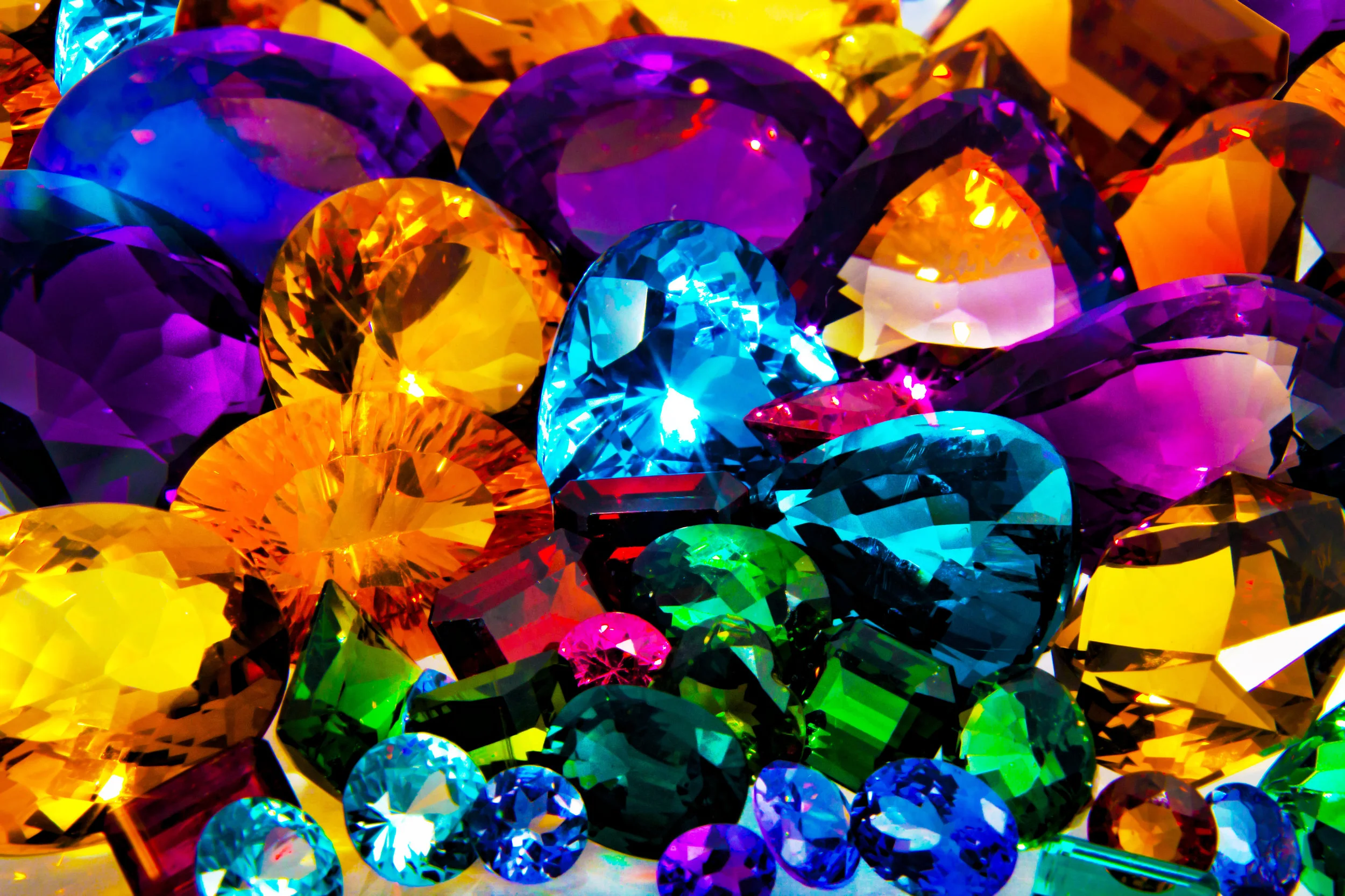
Even amidst all these celebrities, it was hard to miss the prevalence of jewel tones everywhere. Across the board deep blues, vibrant greens, and beautiful reds adorned dresses, flowers, and decoration. Emeralds, rubies, and sapphires were called to mind as we watched guest after guest come and go from this lavish affair. Princess Eugenie even borrowed a tiara for her special day filled with incredible emeralds from The Queen.
Will we start seeing rich jewel tones in paint colors coming out in the next year? When we go shopping for a cocktail dress to a holiday party will we see lots of deep reds, blues, and greens? Jewel tones are incredibly beautiful and bold. Most people wouldn’t mind picking from these beautiful hues.
Princess Beatrice is the older sister of Princess Eugenie. Though not currently dating anyone, it is fun to surmise what another royal wedding might bring. What colors will she choose? What will the guests wear? Will we see these colors creeping across the pond and into our homes the following few months?
We can only assume that it will be a lavish affair that people all over the world will be interested in and take time out of their schedules to watch. Royal weddings, though not a regular occurrence, have quite the effect on the world around them.
In Conclusion
If you have been inspired by either of the recent royal weddings and want to incorporate those colors into your home, call the experts at Omorfia. They will meet with you and together make a plan on how to bring the beauty of the royal weddings into your everyday life.
Omorfia is the word for beauty in the Greek language. Let them help you. If you call them now, you can schedule a 90-minute consultation for $99.00. Or, if you are on the fence, they will speak with you for 30 minutes on the phone for free. After hearing their ideas and how they can incorporate these beautiful colors into your home, you will want to hear more! Check them out today.
Top Color Trends for Spring 2019
As 2018 is coming to a close, it is time to start looking ahead to 2019 and how you might be able to redecorate in the new year! If you are beginning to plan your New Years goals, and one of your intended goals is going to be to renovate a part or your entire house, you will want to know what colors will be in trend for 2019.
As 2018 is coming to a close, it is time to start looking ahead to 2019 and how you might be able to redecorate in the new year! If you are beginning to plan your New Years goals, and one of your intended goals is going to be to renovate a part or your entire house, you will want to know what colors will be in trend for 2019.
Interior paint colors change seasonally and annually. It is essential for you to know what colors will be in fashion before you start planning your renovation. Omorfia Designs can help you decide what colors are trending and what works best for you.
Omorfia is the word for beauty in the Greek language, and that is what they will bring to your home. The designers at Omorfia want to take your ideas and create something in your home you will be proud to show off and live.
Ashley Dupert, our lead designer says, “We design beautiful spaces for beautiful people”.
How to Choose Your Colors
It may also be helpful to look at paint companies like Benjamin Moore or Sherwin Williams. These are great companies to listen to when planning any painting project.
If you want to go at it alone selecting colors that appeal to you, here are some tips for color palettes you can look forward to seeing in the spring of 2019. However, if you are looking for help in your quest to renew the look of your house, the experts at Omorfia Designs are here to help.
Spring and Summer 2019 Forecasts
The forecast for spring and summer 2019 colors all revolve around calm tones, with an overarching theme of love. This means soft tones in blue and teal, as well as palettes of orange, green, and purple, lend itself to beautiful rooms with life-giving feelings.
Looking ahead at the color forecast for spring and summer 2019, there are a variety of colors and color combinations that are unique and fresh, and that pair well together. It is easy to see the inspiration from nature, as well as love.
Pantone
The Pantoneview Colour Planner for the spring and summer of 2019 offers “wistful, unrequired and blooming to treasured, transporting and celebrated” colors of love. These feelings present themselves throughout our lives, and we find them in many different and unique aspects. Similar to the notion of love, the arrangement for spring colors are complicated and constantly changing.
Forecasted colors for spring and summer 2019 will be evident across the board, from women’s clothes to interior paint, from furniture to clothes for the family, even exterior paint. You will see evidence of this motivation wherever you look next spring. If you are looking for interior paint colors to don the walls of your house, you will be pleased with this forecast.
Core Colors
For a calm and relaxed palette, these core colors will combine with bold tones and muted hues and will work well with many other palettes. This palette features a soft blue and green base, with accented orange, yellow, and pinks and combines some dark and black tones to balance out the feeling.
This combination will be beautiful on the walls of your home in interior paint colors, as well as in the accents you choose to decorate the rest of your home. You will find no shortage of inspiration when it comes to finishing the look of your home if you start with these core colors.
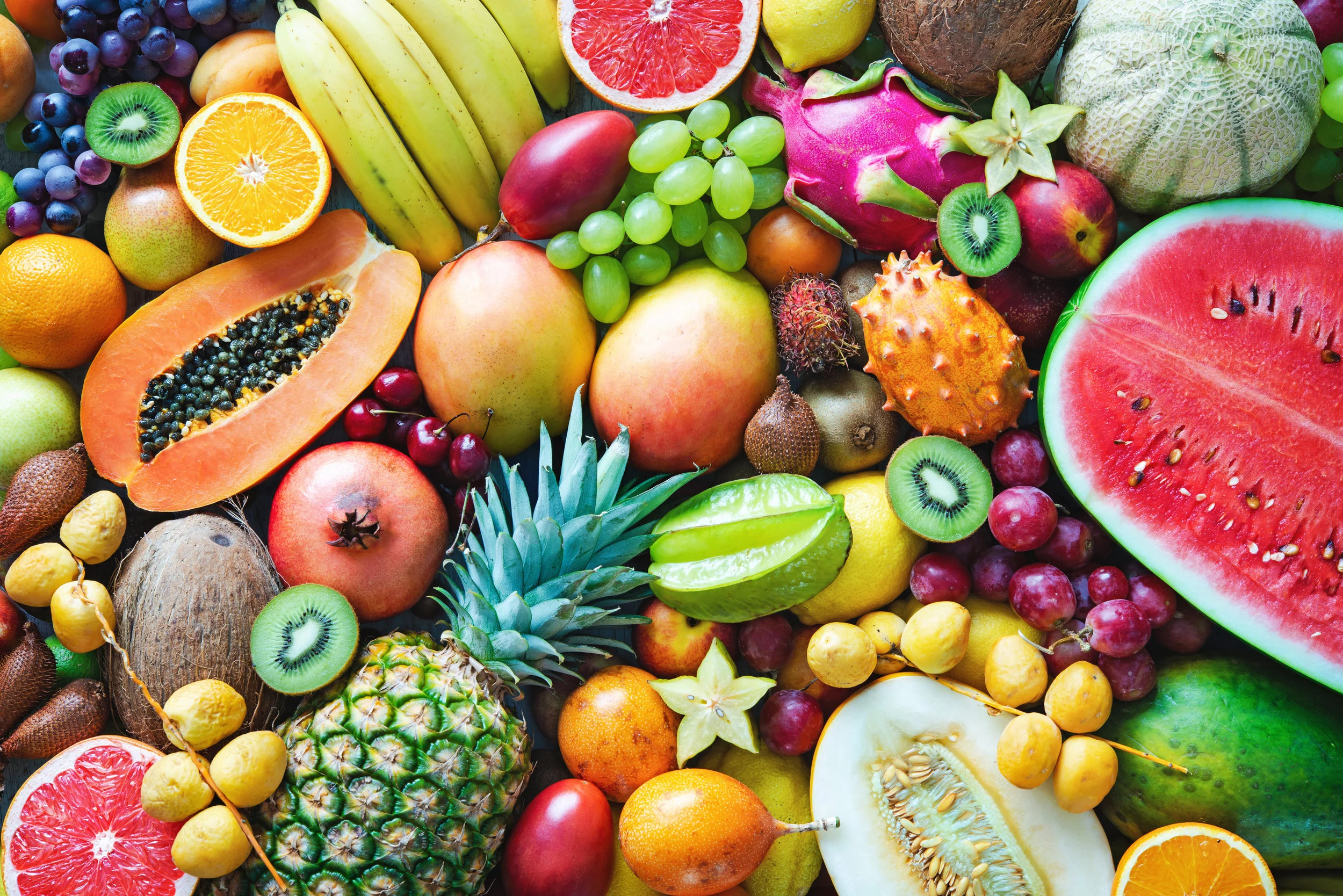
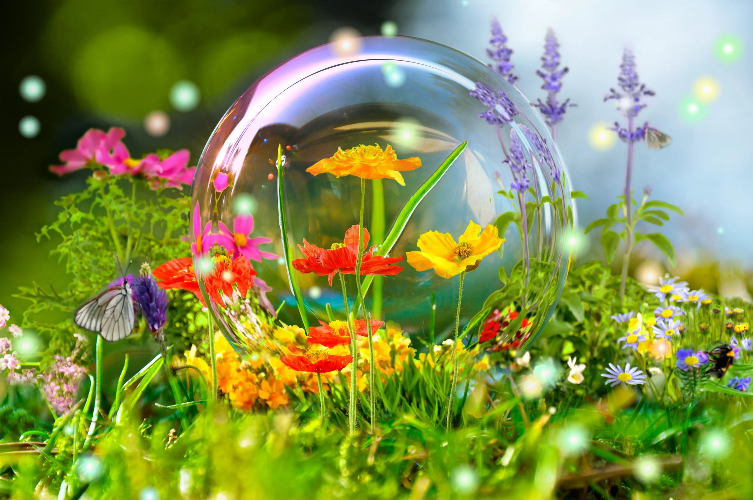
Tropical
Combine the core palette with tropical accents for a unique and fun look. These orange, mint green, deeper red, and yellow tones will stunningly compliment the core palette. Think kiwi, strawberry, watermelon, mango, and cantaloupe.
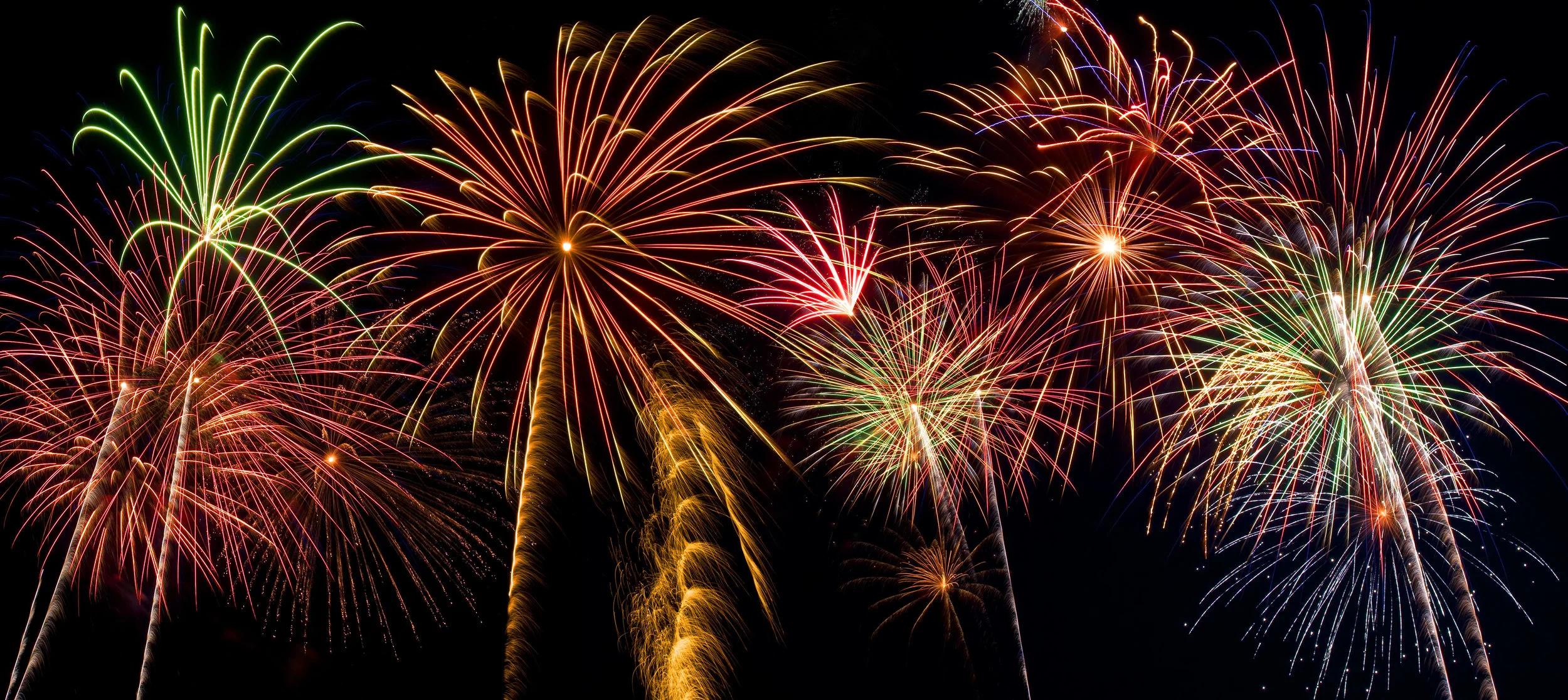
Dance
Inspired by techno dance and music, this palette features a black to a white range with bright colors pulled from along the spectrum. Radiance and bright tone abound in this lively palette. An image of fireworks exploding in a night sky comes to mind as you imagine this palette.
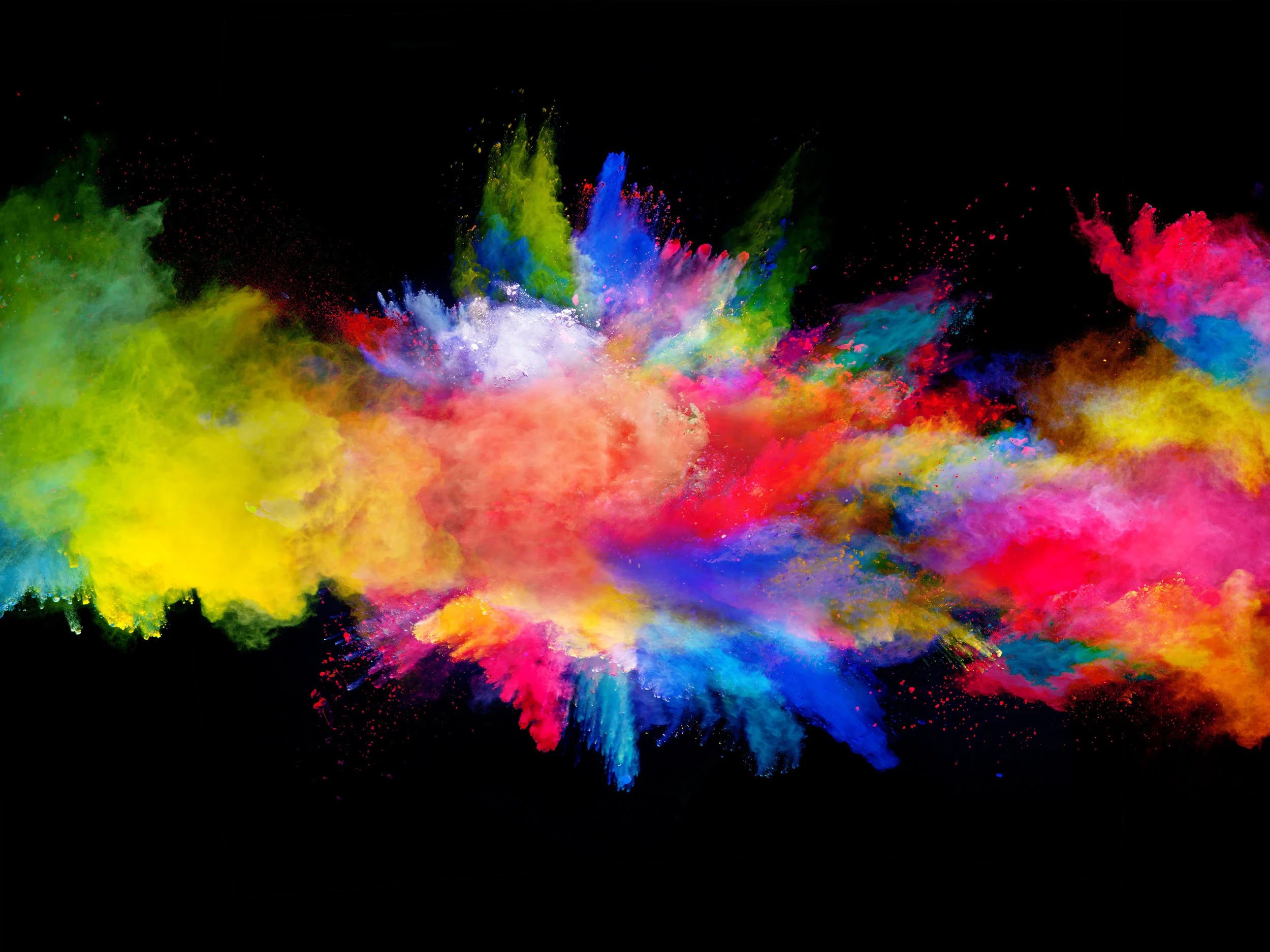
Fantasia
Inspired by the free-form music with a familiar improvised style, this color palette is bright and beautiful and unrestricted. Colors collide to create new and unique combinations. In this bright palette, you can enhance the bright colors or tone them down with more natural hues. Beautiful oranges, purples, blues, and greens abound.
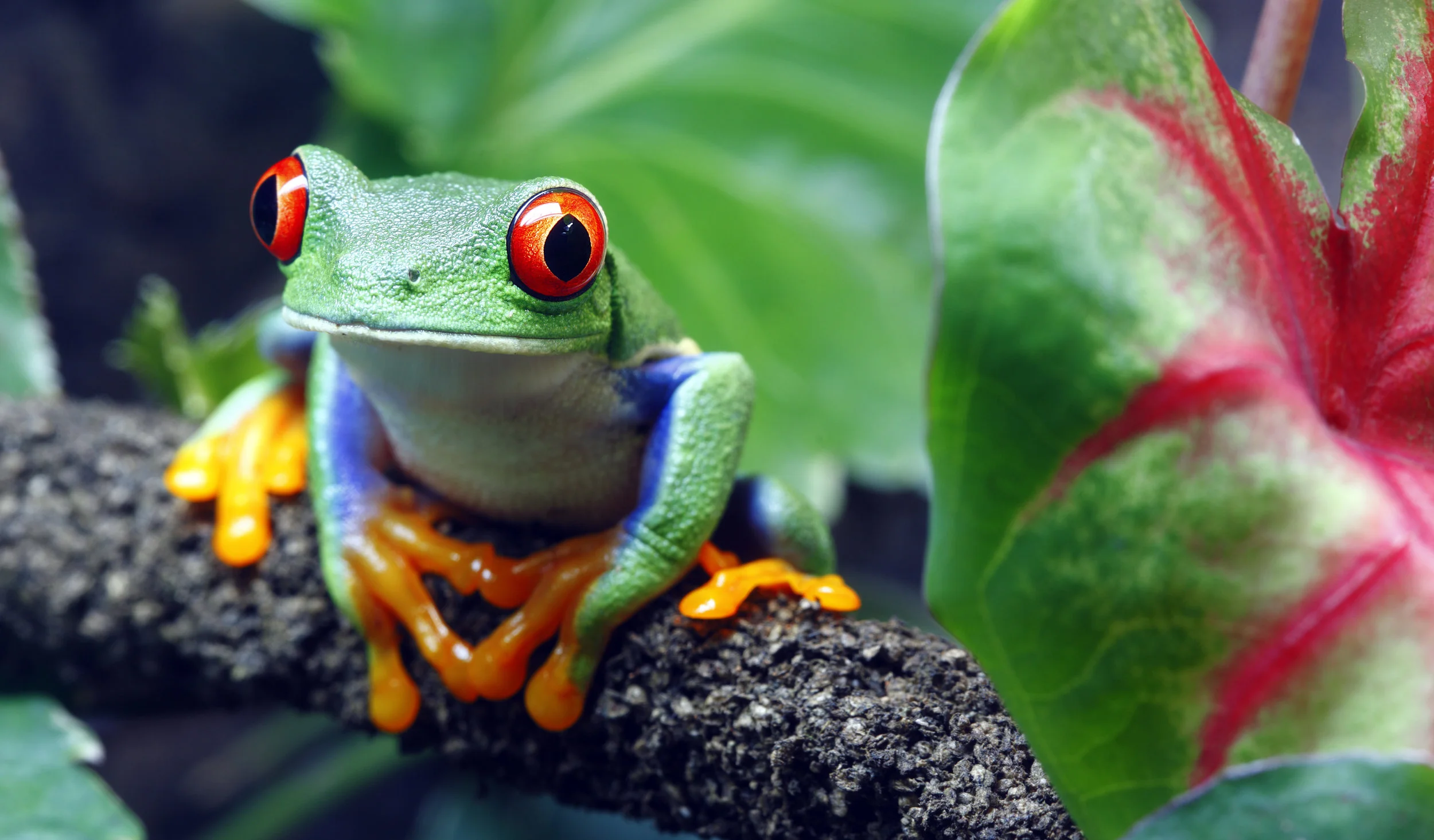
Jungle Jam
Designed with a nod to natural tones and elements, this palette features intense blues and beautiful greens with red and orange in the mix to keep things bright. Picture a tropical tree frog or beautiful flowers, and you can imagine the unique aspects of this palette and how beautifully it pares with the core palette.
In Conclusion
Imagine enjoying the blooming trees without having experienced the dark of night. Without the hushed tones of dark, it is impossible to recognize the light. By paring these dark tones and bright colors, we can reflect nature and appreciate the innate beauty we see around us. By using these colors, we can bring the beauty of nature into our homes.
Omorfia means beauty. If you are overwhelmed choosing colors for your home, consider calling the experts at Omorfia Designs. They will come into your home and bring your ideas to life.
They have the experience needed to draw out the beauty of nature and love and display it in your home for you to enjoy every day.
Right now, they are offering a $99.00 special for a 90-minute personal design consultation. Or, if you are unsure, try talking with them for 30 minutes with a free phone consultation.
Omorfia Designs and their expert staff are waiting to hear from you so they can bring your ideas to life. Give them a call and see what they can do in your home.