
Design; Colors and Trends for a New Year
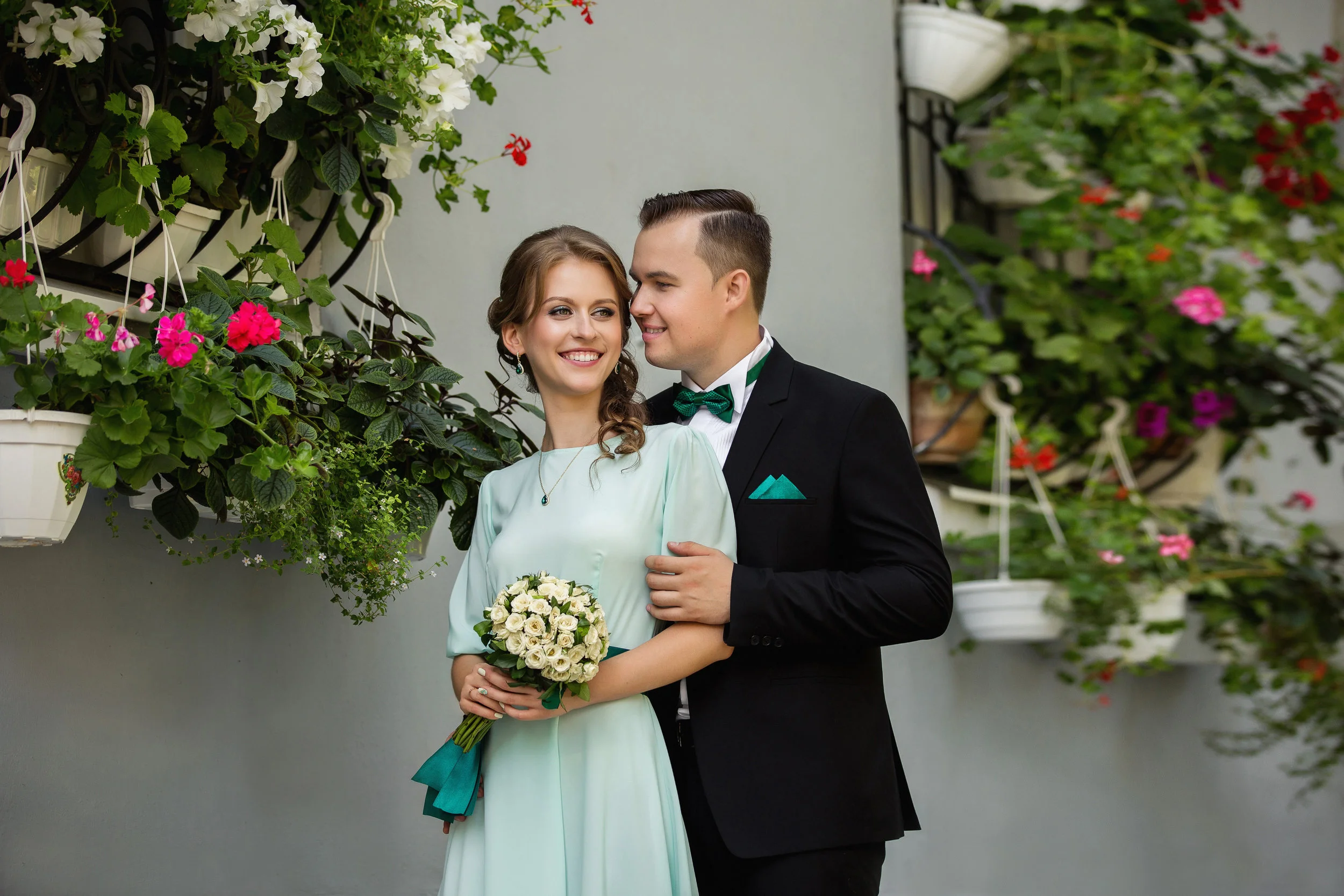
Hello Everyone, here in Sioux Falls things have been in a state of deep freeze, for a couple months now (although winter has been pretty mild so far, so no complaints!) We thought in honor of the start of a new year- we would update y’all on our very own DUPERT FAMILY HOME. If you know the owners of our company: Ashley and her husband Jared (aka. “Mister Omorfia,”) then you’ve probably met at least one of their 4 beautiful daughters: Riley, Peyton, Braylin or Charley. To know the Dupert family is to know Patience, Resilience and Faithfulness in The Lord. {If you are new to these parts, you can CLICK HERE to get to know the Dupert Family, a little better!} The Dupert’s have been in this home for many LOVE FILLED years. God has provided a safe haven/shelter within these walls for their family to grow and blossom!! So now after- 12 years, 4 children (3 TEENS!), 3 dogs, 3 bedrooms, 2 bathrooms and 1 unfinished basement…. this HOME is finally getting the TLC it deserves.
*If you’re an avid follower of our Instagram Stories, you’ve seen some major progress pictures recently!! They’ve updated the ENTIRE House and we’ve got the 411 on the whole process (we’ll have a blog about the entire process, in the future!)
As if carrying an entirely new beginning with it- the New Year has rushed in like a wind. With 2020 leaving a resounding chaos in its wake, the world is struggling to find a new “normal” in all of the uncertainty… grasping at anything that remotely resembles some of the life we once had. So it is with great pleasure that we start 2021! We press on and push forward toward a fresh start with new goals, new concepts, new ways of thinking and most importantly NEW DESIGN/COLOR TRENDS!!!
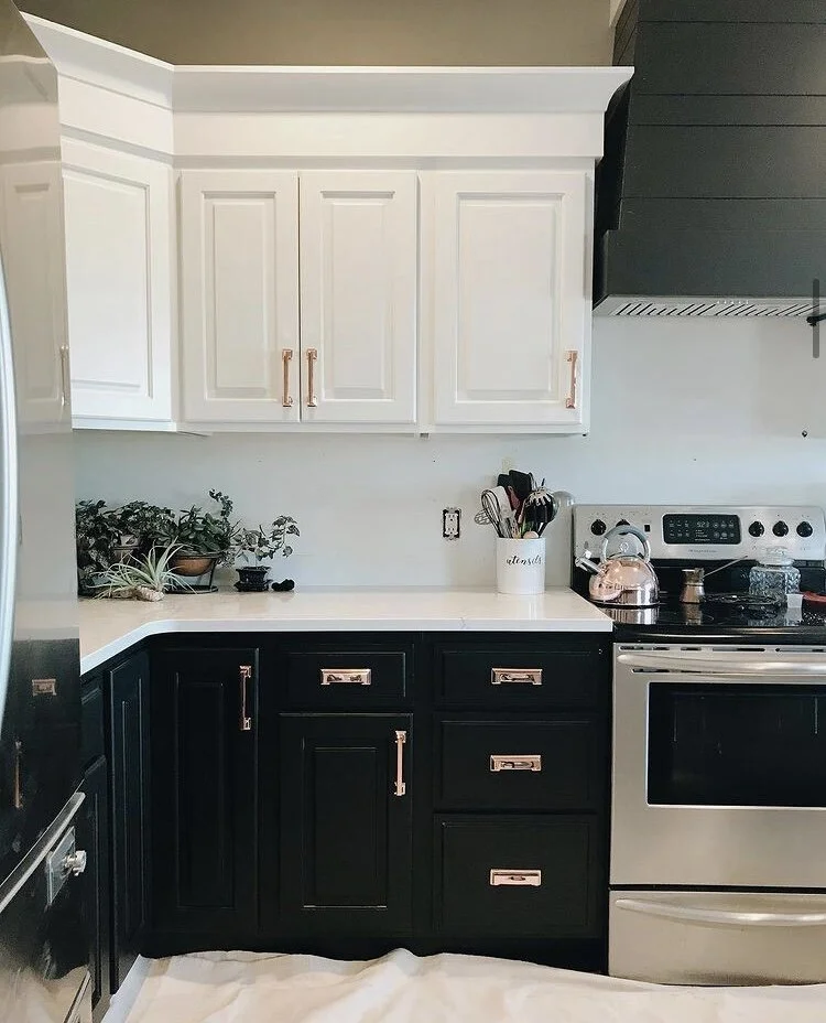
Progress on the Dupert Family Kitchen Renovation.
It has been a long standing tradition for companies to release color forecasts for the next year, pointing toward the top emerging trends for the design world. Companies like Sherwin-Williams, Behr, HGTV and Benjamin Moore have all released their own colors of the year, but none are as influential or highly anticipated as the Pantone Color of the Year. The trend analysts at Pantone Color Institute, have the thankless job of deciding the new color of the upcoming year. 2020's Classic Blue (chosen long before the year's tumultuous fate, was sealed) was all about "calm, confidence and connection.” Now, as the world has turned over a new page- Pantone has chosen two colors of the year! This is only the second time in it’s 20-year history that two shades were chosen (the first in 2016; Rose Quartz and Serenity gradient.)
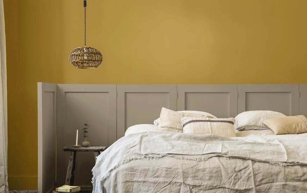
Pantone Color of the Year: ULTIMATE GRAY & ILLUMINATING
“The selection of two independent colors, highlights how different elements can come together, to express a message of strength and hopefulness- they can conveying the idea that it’s not just about one color or one person, it’s about more than one.” “The union of enduring Ultimate Gray with vibrant Yellow Illuminating, expresses a message of positivity and happiness supported by fortitude. Practical and rock solid but at the same time warming and optimistic, this is a color combination that gives us resilience and encouragement- that is essential to the human spirit,” says Leatrice Eiseman, executive director of the Pantone Color Institute.

Illuminating Yellow
Illuminating— is a lemony, cheerful hue that has a sense of delight, warmth and power. It casts light, positivity and visibility on everything in its path... similar to sunshine. Yellow is often considered the brightest and most energizing of the warm colors. It’s associated with optimism, happiness, hope, building confidence and encouraging communication. Yellow’s vivid appearance means its best used when you want to command attention so it works well as an accent color. Because of its intensity/boldness, it can effortlessly overwhelm- so it is best to use in small amounts and balance it with a subdued/basic hue. The overall vibe of your space will turn fun and moody, with the bold pop of yellow bringing energy and color throughout a neutral backdrop.
Ultimate Gray
Ultimate Gray— a neutral, generally considered on the cool end of the color spectrum. This durable shade has a deep connection to natural dependable elements (rocky cliffs, pebbles on the beach, stone formations, ancient temples and monuments) that highlights an ability to withstand the ravages of time and provide a firm foundation. Gray quietly assures encouraging feelings of composure, steadiness and resilience; it reminds us of eternal basics and balance. Since it is subdued and reserved…it can sometimes be considered conservative, moody, dull, emotionless or depressing. It’s a diplomatic color, negotiating all the distance between black and white, it is impartial- most commonly associated with neutrality, conformity, compromise and modesty. Since it is ultra-saturated, use furniture and decor that would contrast and soften the color.
Ultimate Gray and Illuminating encapsulate thoughtfulness, with the promise of something sunny and friendly.
Incorporating Color Trends into your Home
Pantone suggests “applying them in the way that they were intentionally chosen: use Ultimate Gray as your foundation and tie in bursts of Illuminating.” In design, Gray backgrounds are very common- timeless, practical and versatile; making a great canvas to a wide variety of colors. Incorporating Yellow into more muted color schemes can create a relaxing environment, uplifted by the burst of brightness. Ultimate Gray provides a firm foundation for Illuminating Yellow, that heightens awareness and enhances intuition; they increase intellectual curiosity, originality, creativity and mental resourcefulness. Even on the exterior of a home these colors can evoke the same emotions, says Pantone “Painting a front door in bright yellow Illuminating conveys a warm and welcoming message when supported by solid and dependable Ultimate Gray in the exterior finishes.” Dress up Ultimate Gray with rich neutrals like leather, dark brown woods, stark blacks/whites and some textured tans—embracing a neutral palette while creating a space with a ton of depth. Capture the energy of Illuminating, throughout your architecture by painting archways, adding wall art or accent chairs; this is a fun way to bring in a bold color that you aren’t ready to commit to on a larger scale.
*The most important thing to remember is BALANCE!

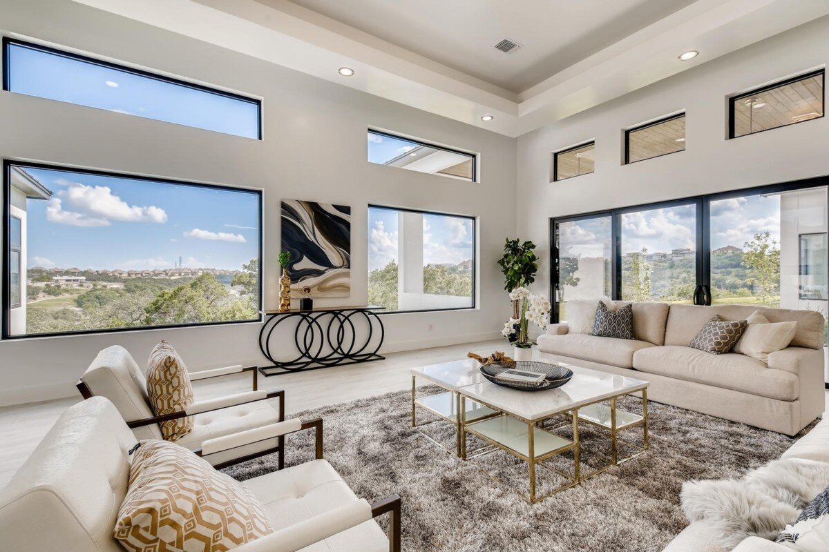
Inspiration for using your homes architecture to add a pop of color to a neutral color palette.
Design Trends on the Rise in 2021
Gray Color (and All Neutrals)- Neutrals are timeless and exciting- differing shades create a calm/serene atmosphere. Neutral colors are more effected by the colors that surround them. Neutral colors often have great versatility- serving as both, center stage or a great backdrop to base a design.
Industrial Interior Design- Generally, this trend is about incorporating unexpected materials and giving a raw, unfinished look in your interior. Key characteristics of industrial design: provide style and function, exposed ducts/pipes, wood and metal surfaces and vintage furniture/ accessories.
“Grandmillenial”- This type of interior design, brings the nostalgia! Mainstream culture might consider this traditional design “outdated” or “stuffy.” Give a 21st-century makeover, to the floral and chinoiserie-filled interiors our grandparents once enjoyed.
Vintage Style- This type of design utilizes symmetry and natural materials such as wood, stone and forged elements. Combine artificially aged décor or classic design styles from the 20th century, with new elements to create a harmonious feel without being outdated.
Houseplants or House Gardens- Houseplants/gardens create a layered space and welcome the outdoors in. Research links our natural environment to human well-being/mental health. This type of design creates connections with nature while allowing us to unwind from our tech-driven lifestyles.
Decorative Glass- A form of art that can express your feelings and create a personalized space. Adding glass to the walls or floors (glass ceilings, decorative windows, dividers, etc) comforts but also utilizes decorative elements to create an atmosphere.
Organic Products (Including Sustainable Products)- This type of design, focuses on sustainable materials/products with an emphases on functionalism. Organic design embraces green living; from furniture to fabric- you incorporate more natural characteristics!
Statement Pieces- Add character, flair, depth and personality to your space (color, artwork, furniture and lighting.) Statement pieces are pieces that- draw attention, are bold and unique from the surrounding elements and stand alone, as a point of interest.
Wild/Textured Walls- Textured walls are an artistic expression with functional purpose, as they help hide signs of drywall installation. Wall coverings (wallpaper, tapestries, etc) can simulate natural elements or give you that wild pop of character, your space is missing.
Bright, Happy and Mood Enhancing Décor- This type of design focuses on improving humans’ responses to the environments around them. Incorporating different colors, shapes, lighting and textures to create/enhance a specific mood.
Mood Enhancing Decor: incorporates texture, shape & lighting to create the desired mood!
Our Designers want to HELP!
Here at Omorfia, our desire is to make life better and more BEAUTIFUL for you! If you’ve fallen in love with this years Pantone Colors of the Year (or any new color palette) and you want to incorporate it into your current style; but you aren’t sure how? Start by chatting with us in a FREE 30-minute phone consultation or schedule a personal {$99/2 hour} appointment with one of our designers. Call us at 605-223-0193 OR go to omorfiadesignsinc.com/getstarted

Top Interior Designers Reveal the Most Popular Trends in their City
Check out this article featuring Omorfia Designs Inc highlighting designs trends across the nation.
Check out this article featuring Omorfia Designs Inc highlighting design trends across the nation.
Written by Mekaila Oaks with Redfin
With all the time spent at home recently, you might be starting to grow tired of the same home decor you’ve had for years. You’ve likely been scrolling through Pinterest for inspiration or maybe you’ve been looking at beautifully-staged homes for sale online. No matter where you’re looking for design ideas, it can be overwhelming to find a starting point, let alone a style that fits your home. Don’t worry though, the searching stops here. To help spark your creativity in redesigning your home, we’ve asked interior designers from across the country to share the most popular trends in their city. Here’s what the top interior designers say are in — and what’s out — when it comes to interior design trends this year.

All things natural in Birmingham, AL
Alabama is seeing a huge trend in natural materials as the accents in every design. Grasscloth treatments on the wall, cedar beams on ceiling applications, and creative uses of natural stone are just a few examples. Texture layering is taking a priority over pattern and color, as neutrals are still holding strong. – Nicole Shultz, Limerence Design
Industrial modern flair in Anchorage, AK
Alaskan new build homes are embracing the use of multi-surface exterior siding to include concrete, sheet metal, and iron. The trend to mix and match results in an industrial modern flair and proves highly practical for our oftentimes harsh climate. – Scotti Steele, Steele The Stage
Embracing rustic contemporary designs in Prescott, AZ
The most popular style trend in Prescott is rustic contemporary. Open floor plan homes with high ceilings, featuring rough sawn beams paired with clean lines, white and muted earth tones, warm wood flooring, sleek granite and quartz countertops, and lots of large windows to showcase the breathtaking scenery are highly sought after. When a client requests a pop of color, it is typically utilized in art and other decorative accent pieces. – Christine Hardin, Niche Design Co.
Enjoying the scenery and outdoor spaces in Little Rock, AR
Clients have shifted towards wanting to create or expand on their outdoor living spaces, such as extending decks, adding built-in seating such as banquettes around the perimeter, to even adding simple exterior touches such as window boxes with flowers or sprucing up the landscaping. Since Arkansas is “the natural state,” the scenery and surroundings are always so beautiful here so I love that I’m seeing a shift towards them being enjoyed more in our own back and front yards. – Kathryn J. LeMaster, Kathryn J. LeMaster Art & Design
Neutrals are always in season in San Diego, CA
Oversized windows and doors that allow for a year-round indoor/outdoor living concept are a top trend. Natural elements and neutral palettes that flow with the exterior – too many bold colors and patterns tend to take away from letting the surrounding views shine. Whites and woods in any combination are always in season. – Aleigh Sampson, Dwelling Well Design

“Sacred luxe” is what interior designers are loving in Los Angeles, CA
We’re beginning to see a transformation emerge, particularly in large-scale homes where it can be challenging to create an overall look that feels warm and inviting, into highly personalized spaces that are vibrant, healing, and uplifting. Each design decision – from color palette to furniture choice, lighting, art and decor – is becoming so personality-rich it’s generating an overall soulful look and feel to a home. Our approach is to think in terms of liveable sanctuaries, spaces that work for you rather than against you. We like to call it Sacred Luxe. – Kim Colwell, Kim Colwell Design
Maximalism meets exoticism in high-end Greenwich, CT homes
With our high-end clientele, the most confident of the three prevailing current trends is maximalism meets exoticism. Each piece is a standout work of art but restrained enough to showcase the exotic colors of the current aviary trend we are seeing. Picture a tropical bird’s plumage—the blues, greens, reds, and oranges are now being joined with purple and lilac hues and mixed with the softer tones of aqua mint in the areas of art, fabric, and rug design. The complexity and beauty of this trend is indescribable and palpable. – Beth Krupa, Beth Krupa Interiors
Traditional and transitional vs. contemporary styles in Davie, FL
Traditional and transitional style homes are the predominant type of construction throughout our beautiful city of Davie and vicinities. However, more contemporary style homes have been recently found. Blu Ink Interiors’ general style is the perfect balance between clean, colorful and neutral finishes, with well thought out spaces. – Juanita Sierra, Blu Ink Interiors
Swapping Mediterranean styling for coastal contemporary in Naples, FL
The trends we are seeing in SWFL are the continued rapid removal of the Mediterranean styling and a push for coastal contemporary. This light, airy, and crisp design aesthetic is also morphing as homeowners look for their own personality. We are seeing mid-century modern and farmhouse influences woven into the designs. – Lisa Davenport, LDD Interiors
An eclectic modern style for the emerging home office trend in Atlanta, GA
A dedicated home office space that incorporates technology and comfort to promote a productive work environment has been trending here in Atlanta. Especially as many people are now working from home and potentially will be for the rest of 2020. We are seeing an eclectic modern mid-century style trend with natural tones and pops of blues. Try Sherwin Williams “Waterloo” and lots of natural light to increase calmness and boost productivity in your home office. – Lara Morrill, Acquire & Design
Industrial farmhouse is a top trend in Yorkville, IL
The trend that we are currently seeing our clients ask for is the “industrial farmhouse.” Industrial farmhouse style combines the comfortable and warm, open farmhouse atmosphere with the edgy lines of industrial style. These edgy lines might be in the form of floating shelves, hog wire stair railings,or edison lights. Because the industrial look can feel cold at times, the combination of the two can warm the house up and give a good contrast between city and country living. – Cheryl Lee, CL Design-Build
Interior designers are getting creative with terra cotta in Barrington, IL
We’re seeing common themes like old techniques that are making a comeback and an emphasis on earthy tones and natural materials. One trend we’ve seen is terra cotta. Simple and straightforward, perfectly imperfect – that is the natural beauty that terra cotta brings to a space. Warm in its orangey-pink hue, or achieving a variety of sun-kissed colors, this material makes a wonderful choice if you are seeking texture in your space. – Kate Marker, Kate Marker Interiors
Creating “wow” moments by color-contrasting in New Orleans, LA
Neutral wall colors throughout the house are themes with most of my clients and we introduce contrasting “wow” moments with deliberate color-contrasting selections in specific rooms. From painting bedroom doors black, to painting a foyer closet floor-to-ceiling in a high-gloss orange, to custom hand-painted wall murals in bathrooms. Creating special moments throughout the house introduces elements of surprise and unexpected moments of joy. – Sherry Shirah, Sherry Shirah Designs

Incorporating texture and neutrals in Baltimore, MD
For 2020, I am still seeing the gray/greige trend hanging around, but neutrals and updated beiges are being added into the mix too. If your decor is falling flat, generally it’s not a color problem, but a texture problem. Add soft pillows, fluffy throw blankets, raw, natural wood, galvanized tins and shiny metals and your space will come to life! Vinyl or laminate “wood look” flooring is extremely popular. These products have come a long way and given the ease of maintenance, are often preferred over real hardwood. Gone are the days of trying to keep dark floors clean. Today’s trends opt for a lighter color palette. – Jenna McElwain, Jenna Nicole Interiors
Saying goodbye to “all grey everything” in Minneapolis, MN
We are seeing the resurgence of warm colors and tones as we move away from the “all grey everything” in Minneapolis. Mixing a cool and warm palette ensures that the designs are fresh but also timeless. – Kelly Hayes, Carriage House Studio
Splurging on home luxuries and stained finishes in Omaha, NE
As most of our clients are spending more time in their home, they are recognizing the need for updates and are looking to add more “home luxuries.” We’ve noticed that our clients are using their intended travel and vacation budget on home improvements. However, they aren’t just doing the basic updates. We have spent more design time on “vacation at home” projects, including pools and pool houses, spas, and outdoor living spaces – Lorele Lesoing, Lee Douglas Interiors
I’ve noticed a shift back towards stained cabinetry albeit in a clean, more modern way. With so many homes that were built in the 80’s-early 2000’s being heavy with red oak (cabinets, flooring, and trim altogether), it became popular to paint these for a more modern look. But, recently, a lot of projects are moving towards staining these floors really light and adding stained cabinets instead of painted. – Leah Scheppers, Iconic Styling
Appreciating the feeling of home in New Hampshire
We live in a conservative refuge of a land in New England and Southwest New Hampshire, not altogether influenced by trends. However, I am seeing a greater appreciation for home as a refuge and joy which translates to neutral kitchens and baths, a taste for luxury indulgences wherever possible, and pops of bright colors in art and accent. I am also seeing a great deal of confidence and willingness for self expression. – Ann Henderson Interiors, The Art of Inside

All about the faux alternatives in Milburn, NJ
One of the more popular trends that I have seen this year is the move toward faux animal skins. The color and diversity available has offered the homeowner so many choices to create a beautiful design for their home with a cruelty-free product. Moreover, the price point of the faux alternatives is attractive. – Risha Walden, Walden Interiors
Interior designers are going bold with the blue hues in Atlantic Highlands, NJ
Go bold with rich blues. Anything from blue kitchen cabinets to a blue tiled wall in a bathroom, our clients have been loving bold blues. Being near the shore, our clients are inspired to bring the colors of the ocean and sky into their homes. We don’t see this trend going anywhere soon. – Katy Champion-Uras, Swell Design Co.
Carving out a space of your own in Cliffside Park, NJ
New Jersey was one of the hardest states hit initially by the pandemic. We are redesigning spaces such as parts of guest rooms, small nooks in the master bedroom, and areas in larger closets. We’ve even changed walk-in closets into rooms with lush comfortable chairs, ottomans, chaises, small tables, and desks separate from the hustle and bustle of the family. The color palette seems to have a spa-like quality in soft grays or beiges for the walls and furniture with accent colors in jewel tones. – Jennifer Lewicki, Judi Schwarz Interiors
The home office might be here to stay. Add an ergonomic chair with an attached computer tray or a height adjustable standing desk. You can create a home office out of a walk-in closet, a shed in your driveway or backyard, part of an enclosed terrace in your apartment, or just a small corner of a den, bedroom, or kitchen. Use a curtain, a room divider, or a decorative screen. Carve out your space, it’s like a treasure hunt just find the clues to your personal treasure. – Judi Schwarz, Judi Schwarz Interiors
Loving natural light in Raleigh, NC
In North Carolina, we enjoy an abundance of sunshine and an equal amount of beautiful trees. That translates to a lot of design attention on windows in our homes — from the advances in the construction phase right down to the DIY or professional installation of UV films inside to protect floors and fabrics. This is a trend that just keeps getting stronger and at every price point. Homeowners want to bring in the sun and feel the presence of the great outdoors from every possible room. – Anne DeCocco, DeCocco Design
Creating a peaceful space for yourself in Charlotte, NC
More recently, my clients have requested spaces to be delegated for quiet activities such as reading, listening to music, meditating, or yoga. Work-from-home areas could also meet this need, if technology such as a laptop or printer can be hidden from view and softer furnishings, a comfy sofa/loveseat, or pair of chairs with an ottoman can be incorporated. They’re also drawn towards outdoor living and dining with water features and lush plantings, fueled by their desire to have a greater connection to nature, fresh air, and a sense of wellbeing. – Wanda Horton, Wanda S. Horton Interior Design
Saying goodbye to typical white kitchens and subway tile in Columbus, OH
The trend in Columbus is finally getting away from white kitchens & subway tile. For so long everyone just wanted white cabinets, counters, and subway tile backsplash – which I understand – it’s a classic. But it gets a bit repetitive and boring. People are finally stepping outside of their comfort zone and either doing a dark island to change it up, or a different color all together. I have seen a lot of “mushroom” colored cabinets, which I’m loving along with a solid marble backsplash to kick it up a notch. – Brittany Poll, WILL + BLU
Interior designers are having fun with deco tiles in Portland, OR
In Portland, homeowners are ready for open and airy bathrooms with frameless glass and floor to ceiling tiles. Clients are in love with all the striking deco tiles that are on the market. We’ve been adding them to backsplashes, floors, accent walls, and showers. Overall, you will find that both modern and classic homes have touches of personality in just the right dose. – Ellen Bene, Bene Interiors

Mixing traditional concepts with modern elements is trending in Philadelphia, PA
The Philadelphia suburb known as the Main Line hews to a traditional paradigm with modern elements thrown in for relevancy and interest. Neutral color palettes remain popular with bold contrasting colors, like navy blue or teal, on a kitchen island or accent wall. Large, open concept kitchens (white cabinets) and performance fabrics are still going strong. Contemporary statement lighting plus modern pieces combined with traditional furnishings, are a popular mix that’s not your mother’s Main Line. – Kat Robbins, Kat Robbins Interiors
Keeping it light and bright in South Dakota
The name of the game in South Dakota is definitely light and bright. What has been known over the last 10-15 years as the “Dakota Brown State,” finally seems to be coming out of its shell. We have loved working with our clients to find ways to bring life and light into their homes while sticking with an overall subdued pallet that allows them to feel comfortable with the change yet excited for the new possibilities the light brings with it! – Ashley Dupert, Omorfia Designs Inc.
Investing in high-end kitchens in Nashville, TN
Homeowners today are re-evaluating the importance of home and placing more emphasis than ever on the functionality of the kitchen. Previously, my clients have been somewhat cautious with their finish selections, always having resale value in mind even in a custom home. Today homeowners are feeling more committed to their homes, which results in them being more likely to splurge on a high-end specialty item, like a La Cornue or Lacanche range that ends up being the piece de resistance. – Lindsay Hunter, Hunter Design
Finding warm textures and updated finishes in Houston, TX
Right now it is more important than ever for people to feel comfortable in their homes. We’re seeing warm finishes and textured furniture pieces making a comeback in a big way. Wooden furniture and cabinetry are made fresh again using updated finishes like cerused oak and by bringing in unique textures such as fluted doors on a bathroom vanity or reeded drawer fronts on dressers. Bringing in these warm, textural elements creates a welcoming and cozy feel that is crucial right now when we’re all spending much more time at home. – Stacy Graves, Stacy Graves Interiors
Moving away from the “hill country” style to a more modern aesthetic in San Antonio, TX
The trends that I’m seeing in San Antonio specifically would be the change from the “hill country” look of browns, a lot of wood, and earthy elements (very Texas-y) to wanting to really lighten and brighten their homes. Homeowners are doing this with white cabinets, grays and whites on the walls, and light colored furniture with pops of color in accessories and artwork. There’s definitely a shift to a more modern aesthetic of how people want their homes to look. – Melissa Fields, Shades of Gray Design
Embracing strong, dark colors — and even wallpaper — in Richmond, VA
Richmond has an interesting mix of older traditional and transitional new construction homes. What we are seeing that bridges the gap between these very different types of houses are homeowners that are embracing strong dark colors, clean lined furniture, and wallpaper. Wallpaper has especially become a favorite for those who want to try something new in order to spruce up or add a focal point to a room. – Gayatri Choudhary, GC Interiors
Interior designers are blending traditional and modern styles in Spokane, WA
In the past few years, Spokane has seen an influx of individuals moving from Western Washington and California, which has introduced more modern and contemporary aesthetics to an otherwise traditional and rustic setting. As a result, the people of Spokane are becoming more bold in their choices, incorporating the new and exciting with their traditional tastes. It is exciting to see, as many of the older and historic homes are also being updated to reflect the unique personalities and blended styles of the homeowners. – Jamie Hartshorn, Jamie Nell Design
Loving outdoor living spaces in Mercer Island, WA
The biggest trend we are seeing right now is a request for highly functional outdoor living spaces that are an extension of our interiors. Since we offer an assortment of outdoor shade, furniture, and area rugs as well, we can create a dynamic and highly integrated living and dining solution to compliment any style of architecture. – Dawn Wilkinson, Six Walls Interior Design
Incorporating patterns and pops of color in Seattle, WA
This year, we have found that our clients want to make the most of every space in their home; think powder rooms, hallways, and entryways. We have loved transforming these small spaces and creating beautiful design surprises with wallpaper. A pattern or pop of color is an easy way to add interest and sophistication to a previously forgotten room. – Becky Ducsik, The Phinery
All about the eclectic accessories in Wyoming
For a number of years the trend in our area has shifted away from the traditional mountain lodge interiors towards minimalist design. While I’m all for uncluttered interiors, they can feel a bit impersonal. I’m happy to see clients refocusing on accessories that bring a bit of fun into their homes. One trend which offers endless quirks is “faux taxidermy,” incorporating items as far ranging as Pendleton wrapped deer mounts to crocheted bighorn sheep busts, or glam chrome faux antler chandeliers. This is a way for clients to set the tone for a none-too-serious home. Vintage ski accessories are still a trend, but there is so much more than the expected wood skis mounted in an “X” above a river rock fireplace. – Shannon White, Shannon White Design
Call us today (605)223-0193 or click HERE to set up a consultation, to let us breathe life into your next project.

International Design Trends Inspired by Cancun, Mexico
As our most avid friends/followers know, it was our owner’s 20th Wedding Anniversary this last week. Can I get an AMEN- for a couple that started their own business, work together, raise 4 daughters & have survived 20 years of marriage- all while staying true to themselves and the plans that the Lord has for them! If you know the Dupert’s you know they are a fun loving, youthful couple… that bring joy and happiness everywhere they go. And if you know THAT, then you certainly know they are not a couple that asks for much. They’re wants never supersede the needs of others, they are always giving with their time/money/talents and they’re never “off the clock.” After saving for this momentous occasion, they decided to pull out all the stops! But they soon learned their anniversary trip, planned for Greece, had a travel ban put in place (thanks Covid)… so what’s the next best thing? Ashley was overjoyed at Jared’s romantic idea to bring it back to the place where it all started; a Honeymoon re-creation in Cancun, Mexico!!

Spanish influenced design, in The Excellence Playa Mujeres Resort.
Here is where our journey into International Design begins-
They’ve been staying at The Excellence Playa Mujeres Resort over this past week and we’ve been so inspired by the resort lifestyle and the people that they met while on their vacation… we decided to showcase some design trends based off the Spanish culture and show you how you can bring a little bit of Cancun, right into your own home!
Cancun is a tourist destination that is known for it’s white sand beaches/turquoise seas, international cuisine, resorts & nightlife! It is one of the gateways to the Mayan World, steeped in the rich history of Mayan culture & language with archaeological ruins dotting the land, dating back to the 6th century. In Cancun there are wonderful natural attractions such as the majestic mangroves, sand dunes, lush jungle, lagoons and swimming/diving in the mystic cenotes (natural sink holes) where you can enjoy countless adventures. The Isla Mujeres is part of the Yucatan Peninsula & is one of the most popular islands in the Caribbean and is a magical community- a place for romance and relaxation. The island lies close to nature and you must take a short fairy ride to get there- it is a shining example of undiluted Caribbean culture. It’s geographic location makes it a special kind of paradise, because the island receives the first rays of the sun to touch Mexican soil each morning!!

Moodboard inspired by Isla Mujeres, by designer Aramely Mendez.
How Spanish culture influences decor and home design
Mexico is full of inspiration with its savory foods, cheerful culture & vibrant design, few interior design styles are more romantic than the Spanish design. Part of the Mediterranean family- Spanish interiors are eclectic, warm, welcoming, utterly stylish and embody a sense of traditional Spanish culture. Recognizable by their sophisticated white stucco/stone walls (which provide plenty of texture & interest,) decorative patterned tile work & exaggerated ceilings (where you can’t help but add some wooden beams!) Large arched doorways, scrolling wrought iron accents and warm earth tones are mixed with textile accents of vivid/bright jewel tones of reds, golden yellows, oranges & blues. Spanish influenced accessories like pottery & natural rustic wood elements mixed with dark iron and copper furnishings/décor can be seen both inside and outside the home. Most Spanish houses include an indoor-outdoor element with interior courtyards to embrace nature & that wonderful Mediterranean air. Heavy curtains- hung high and wide to get the most out of their windows- keep homes cool in the high heat. As for furniture you’ll see heavy wood pieces with intricate carvings (a nod to the Spanish-Baroque design) on accent tables, high headboards & even kitchen cabinets. Spanish homes have grand fireplaces and big statement kitchens as the focal points, to bring their families together & center their rooms around. It’s all about embracing history at home, focusing on meaningful objects and weaving them into your decor. Whether it’s a rustic, built-in bookshelf showing off family heirlooms or antique/ornate details paying homage to their history & culture- Spanish homes always maintain that vintage, family home vibe.

Trendy/Modern design with key elements of Spanish inspiration.
Major Spanish design elements, you can easily add into your own home
STUCCO WALLS/ARCHES- The light white or cream (adobe brick/stone) walls help break up the other prominent dark features which are popular in this style. This rustic style adds space depth, warmth and is incredibly inviting and gives a good base/texture for decoration. Curved archways add architectural interest to an otherwise plain space, without going over the top. Common architectural features include ceilings & doorways/windows in hallways or alcoves. Vaulted dome ceilings and oversized, exposed wood beams are beautiful and classically Spanish-influenced & give a sophisticated, open/airy, aged feel.
BOLD COLORS/TEXTILES/FABRICS- Balance bold/bright patterned selections with furniture/furnishings that lean on neutral tones. Experiment with color- your living spaces are vibrant, energetic and colorful (use rich colors like deep blues, golden yellows, vivid reds and lush greens as accents.) Monochrome feels fresh and crisp & various shades of white give the room depth without feeling overly sterile/stark. Add splashes of color and interest throughout your room with traditional Mexican folk art, pottery, beautiful embroidery & hand-made woven tapestries (look for textures of primitive prints/detailed patterns, infused with rich color.)
WROUGHT IRON/LIGHTING- When you’re trying to show off any lighting or ornate furniture, keep the background of the room simple. Much of the lighting in a Spanish home is wrought iron related- heavy & dark and will stand out against your light stucco & dark woods. Tendencies of elongated geometric shapes fusing metal and glass are incorporated into interiors in a variety of ways (chandeliers, railings, etc.) Another trademark lighting style of Spanish style is tin fabricated lights- covered in perforations, allow for a dreamy night glow, some also have frosted or colored glass for added flair.
DARK WOODS/TRADEMARK FURNITURE- Whether floors, ceiling beams or fireplace mantels- dark varieties/mixes of wood such as walnut or mahogany are key. Most furniture is commonly constructed from pine, mesquite, reclaimed wood & wrought iron in light finishes for a distressed, natural/weathered look or stained in dark, rich copper tones. But with an extensive leather industry, equipale pieces (hand-made furniture with all-natural materials) are a prominent feature in Spanish design. This durable furniture blends rustic detail with an organic woven-wood shape, creating cozy seating with an authentic Spanish charm.
TILES/POTTERY/TERRA COTTA- Decorative tile accents are possibly the closest you can get to classic, Spanish inspired design with traditional tiles in vivid colors/patterns or contemporary tiles in muted/cement style. Elements of terra cotta give an earthy quality and are widely used in interesting patterns and planters. Talavera pottery (high quality clay- made in Puebla, Mexico) involves intricate and colorful designs, greatly influenced by culture & flora/fauna (tiles, backsplash, dishes, murals, counters, sinks/showers and to embellish fireplace/fountains & other decorative accents ) bring a pop of color and personality to any home.
*DON’T FORGET THE GREENERY- always add low maintenance botanicals like cacti and succulents to offer your interior a desert chic accent & add extra life/nature into your home.

Excellence Playa Mujeres Resort- home design inspiration
How to start implementing your design esthetic
Hopefully you’re as inspired by Cancun & The Excellence Playa Mujeres Resort as much as we are and these ideas have gotten your creative juices flowing (like bottomless mimosas on the beach!) If you aren’t sure how to implement your new design ideas, let us help you transform your space into a Spanish inspired get-away! Start by chatting with us in a FREE 30-minute phone consultation or schedule a personal {$99/2 hour} appointment with one of our designers. Call us at 605-223-0193 OR go to omorfiadesignsinc.com/getstarted

Omorfiá Family Update
Hello faithful family and new friends- it’s been a while since we filled you in on our awesome little company. With so much going on in recent months, projects, and the quick growth spurt we’ve had recently- there is so much amazingness to catch you up on! BEAT THAT CORONA!! 👍🏻
We’ve decided by keeping you consistently updated and creating a space to gain inspiration, ask questions and see the “behind the scenes” work that goes into designing YOUR projects-is an imperative asset to what we want to accomplish with this newly revamped “Designed by Love” Blog!!
For anyone new to Omorfia Designs, we’ll take a second to explain our history. We’ve taken the simple concept of the word OMORFIÁ, which means BEAUTY in Greek (ομορφιά; pronounced ō-morf-iá) and turned it into our brand and lifestyle motto! Beauty in a simple description, is a combination of qualities: shape, color, form, etc. that please our aesthetic senses. We aim to bring that beauty and happiness into every home and relationship... we aspire to change your old spaces into new/refreshing/life-giving/“I never want to leave” spaces. It’s a beautiful thing that we are able to alter our homes and lives as we change and grow through, love, trend and time; becoming personalized reflections of our individual personalities.

The Newest Additions to our Family 💚
Our small business has been owned and operated by Ashley & Jared Dupert for the past two and a half years...and NOW just within the last few months, the creative design team has exploded with the addition of 5 designers, a quick learning intern and Trusty, the shop dog! We all work together to cover an array of design elements including: New Construction/Remodeling, Color Consultations, Floor Planning, Custom Window Treatments & Furniture, Interior Styling, Staging and Retail/Commercial Merchandising. Ashley Dupert is the ring leader of our rowdy circus- mother, friend, confidant & boss babe; master of all product knowledge, ever. Aramely Mendez- art connoisseur; representing our Dominican Republic spice. Kelsey Buelow- double duty new construction/designer; new mother to boot. Jordyn Junkermeier- fresh college graduate; teaching old dogs new tricks. Lindsey Peterson- girl mom, powerhouse; construction/house flipping pro. Mya Chan-absorbent sponge and invaluable intern. Zoe Hill- retail and merchandising design extraordinaire; quasi-wordsmith behind this blog. Meanwhile, Jared Dupert takes care of all things techie, reigns in our FB Marketplace purchases, tells the best dad jokes... not to mention, he’s the emotional sounding board for all this estrogen!
Understanding the Dupert’s and their desires with establishing this business will help you to better understand the core of their company and beliefs: raising up local designers and sending them out (better equipped) with the tools they need while forming a family of Godly people, presenting God’s “OMORFIÁ” to all of His children. The premise of this Blog comes from an utterly raw concept- We are each individually designed out of the most wonderful, beautiful Creator’s love for us “Designed with Love” and we use our God-given talents & time to create with that same love/beauty/dedication “Designed by Love” and we are blessed to go out and share it with the world!

Ashley & Jared at Youth Camp 2018; Thessaloniki Greece 💚
The Dupert’s have created strong missionary roots in Greece throughout the last 10 years- helping establish the first school of worship there (The School of David), forming strong heart ties with Greece’s people and falling in love with their culture AND FOOD! They’ve been confirmed time and time again by the Lord to establish a business model that designates a portion of their profits to be donated to various ministries and their allies in Greece. Creating an underlying, yet equally important motto for the company: “Home Town Design, making a Global Impact.” Their ability to hear and listen to the Lord when He tells them where their next donation NEEDS to go, will always keep Sioux Falls at the foreground of their hearts. Being a local small business solidifies the part of a community that is there to support each other... but more than that, it supports its people in need! (On that note: PLEASE reach out if you know of any various local donations being taken up, we will constantly be assessing where God’s money could be most useful!)
Coinciding with our urge to make our company as personal as possible, we plan on covering a wide variety of info on this platform. We’ll share our wealth of collected knowledge on: our favorite local businesses and national companies to work with (better product understanding, brand rep interviews) answering frequently asked questions (general design know-how, client processes, pros/cons, process with an interior designer) input on trends (newest vs. time tested trends) our current projects (before/afters, steps/processes, follow-ups, client interviews) our inspirations (remodels, new builds, decorating/holiday decor, DIYs, random recipes) our tips and tricks (hot items to buy, sales to shop, spend vs. save, quick/easy home updates & how-to’s) BUT some of the most exciting news we’ll be updating you on, will be the Dupert’s remodeling their own home- with a family of 4 daughters (Riley, Peyton, Braylin & Charley) & 3 fur babies- these full-time parents/entrepreneurs/local church leaders will have their work cut out for them. We will be following along with their own story and using them to give you a first-hand look at the entire experience of remodeling their 12-year-old home, developing a design plan, choosing a style, keeping a budget, product knowledge, all the dirty work & going along for the best part... SHOPPING!!
Dupert Family 2019- Sioux Falls, SD 💚
We are honored and blessed to be on this journey with you and we hope that by giving you an in-depth, up to date and a direct link to all the things God is doing in our lives & the lives of some of our clients... you’ll be able to feel a personal connection with all of us, because once you’re in the Omorfiá family, you’re family for life!
So we encourage you to check back weekly, to see what’s new! If you’d like to schedule your own {$99/2 hour} appointment with one of our designers, to see what we can dream up together- call us at 605-223-0193 OR go to omorfiadesignsinc.com/getstarted

Royal Wedding Colors and U.S. Interior Design Trends Collide
Have you caught yourself watching any of the recent royal weddings? It is hard not to be at least a little bit fascinated by the lavish affairs that are generally broadcast even on our side of the pond. Between the elegant dresses, the incredible floral arrangements, the food, and of course the hats and fascinators, our screens are filled with an array of colors.
Have you caught yourself watching any of the recent royal weddings? It is hard not to be at least a little bit fascinated by the lavish affairs that are generally broadcast even on our side of the pond. Between the elegant dresses, the incredible floral arrangements, the food, and of course the hats and fascinators, our screens are filled with an array of colors.
Is our country influenced by these color choices? How did Kate Middleton’s choices of colors for her wedding affect Americans? Or how about Meghan Markle’s light green arrangements? Or even Princess Beatrice and Eugenie with Eugenie’s recent marriage.
Americans are enamored with the royal lifestyle, so it makes sense that their choices will influence us. Time and again, we have seen colors from a royal affair creep into our fashion and design world. Whatever colors are chosen to adorn the dresses and flowers at royal weddings inevitably invade our walls and wardrobes, too. The experts at Omorfia follow these trends and will help bring these colors into your home.
Mint Green Galore
For the 29 million Americans and 53 million people worldwide who tuned in to watch Meghan Markle and Prince Harry tie the knot, the evidence of Meghan’s favorite color was everywhere.
It is no secret Meghan Markle prefers shades of light green, in particular, mint green. It is noticeable in her clothing choices, and the incredibly popular lifestyle blog she used to run is full of her preferences for this soft color.
Pictures from the royal wedding in May showcase all shades of green. Meghan’s mother wore an incredible mint green dress with a matching hat and coat. The Queen herself, who is known for her love of bright colors, even wore a green jacket over her floral dress. Many of the guests were in similar shades of green. Everyone looked fabulous in this calming yet flattering color.
Since the wedding, Americans have seen a drastic rise in the color green across the board. Interior decorators are filling homes and walls with beautiful shades of green. One of the hottest colors of 2018 is light green. This color is an excellent choice because it comes in so many beautiful shades from mint to chartreuse to sage and citron.
It will not be hard to find a way to incorporate light green as there is a shade for everyone. If you are looking for ways to try out light green without painting a wall or buying a new couch, try throw pillows, curtains, vases, artwork, or throw blankets on your couch. Or simply bring in a bouquet filled with soft green or even a live plant.
If you are sold on this appealing color, there are numerous shades of paints from every distributor that will fit the bill. One particular color that will be easy to find is Pearl Gray from Sherwin-Williams. Painting any area of your home, or even painting one wall as an accent, will create a warm and soft feel. Light green is known to be a calming color.
Will Jewel Tones Be Next?
Though not as heavily publicized or followed, Princess Eugenie is another royal who also had a royal wedding this year. Princess Eugenie is the daughter of Prince Andrew, the third child of Queen Elizabeth and Prince Edward, and Sarah, Duchess of York, though the world knows her as Fergie.
Princess Eugenie is not a “working royal,” meaning she does not perform daily duties for the queen. She is not close in line for the throne; she is ninth in line, so she has fewer responsibilities. That doesn’t stop people all over the world from being fascinated with her and her wedding.
The princess married Jack Brooksbank in October. Jack is a small celebrity himself since he works for the alcohol brand started by George Clooney and Rande Gerber. Many well-known celebrities attended their wedding, including George and Amal Clooney, David and Victoria Beckham, Liv Tyler, Naomi Campbell, and Kate Moss; Andrea Bocelli even performed!
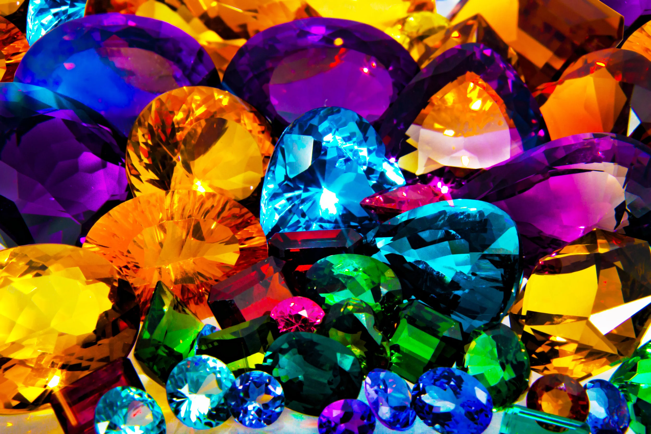
Even amidst all these celebrities, it was hard to miss the prevalence of jewel tones everywhere. Across the board deep blues, vibrant greens, and beautiful reds adorned dresses, flowers, and decoration. Emeralds, rubies, and sapphires were called to mind as we watched guest after guest come and go from this lavish affair. Princess Eugenie even borrowed a tiara for her special day filled with incredible emeralds from The Queen.
Will we start seeing rich jewel tones in paint colors coming out in the next year? When we go shopping for a cocktail dress to a holiday party will we see lots of deep reds, blues, and greens? Jewel tones are incredibly beautiful and bold. Most people wouldn’t mind picking from these beautiful hues.
Princess Beatrice is the older sister of Princess Eugenie. Though not currently dating anyone, it is fun to surmise what another royal wedding might bring. What colors will she choose? What will the guests wear? Will we see these colors creeping across the pond and into our homes the following few months?
We can only assume that it will be a lavish affair that people all over the world will be interested in and take time out of their schedules to watch. Royal weddings, though not a regular occurrence, have quite the effect on the world around them.
In Conclusion
If you have been inspired by either of the recent royal weddings and want to incorporate those colors into your home, call the experts at Omorfia. They will meet with you and together make a plan on how to bring the beauty of the royal weddings into your everyday life.
Omorfia is the word for beauty in the Greek language. Let them help you. If you call them now, you can schedule a 90-minute consultation for $99.00. Or, if you are on the fence, they will speak with you for 30 minutes on the phone for free. After hearing their ideas and how they can incorporate these beautiful colors into your home, you will want to hear more! Check them out today.
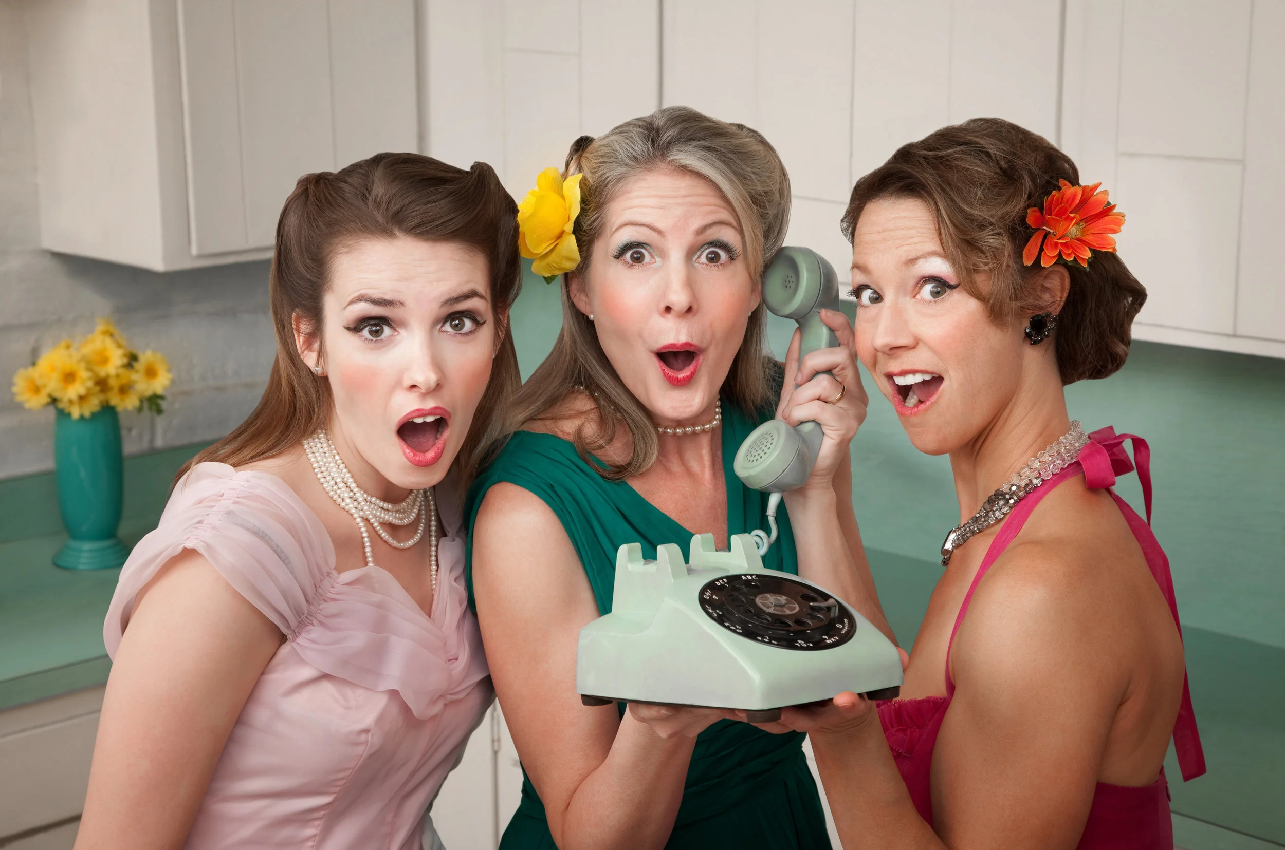
Top Interior Design Trends Throughout History
Interior design is an ever-changing thing. When you look at homes today, you might think that the decor is unique to this time, but looking back at past trends reveals that each decade has some influences from the past.
Top Interior Design Trends
Interior design is an ever-changing thing. When you look at homes today, you might think that the decor is unique to this time, but looking back at past trends reveals that each decade has some influences from the past.
Here are some highlights from the 1940s right on through to today to help inspire your own design ideas.
1940s
The second half of the decade, post World War II, brought new innovations and bright colors into the home. Contrasting the muted colors and industrial look of the 30s, you found bold floral fabrics and wallpapers, bright colors, and curved lines defining the 1940s home designs.
The modernist movement brought a demand in homes’ decor to have style and function. A fold-down countertop or hidden compartment, paired with linoleum flooring, would be a common find in a 40s kitchen.
A few highlights of the popular trends:
Floral and gingham fabrics/patterns
Wooden furniture
Linoleum floors
Coordinated color schemes
Curved lines
Wallpaper in bright and bold designs and colors
1950s
While the 40s had bold and bright colors, the 50s toned things down with pastels, usually pink, mint green, blue or yellow. The patterns and fabrics of the era were influenced by science and space exploration. You could have stars, stripes, fruit, or galaxies on your walls, tablecloths, or sofas.
The influence of Charles Eames on furniture design brought curved, and clean chrome and vinyl furniture. Anyone for a banana-shaped coffee table? Whatever the colors or schemes you might find, there was great emphasis on function, and comfort for leisure activities.
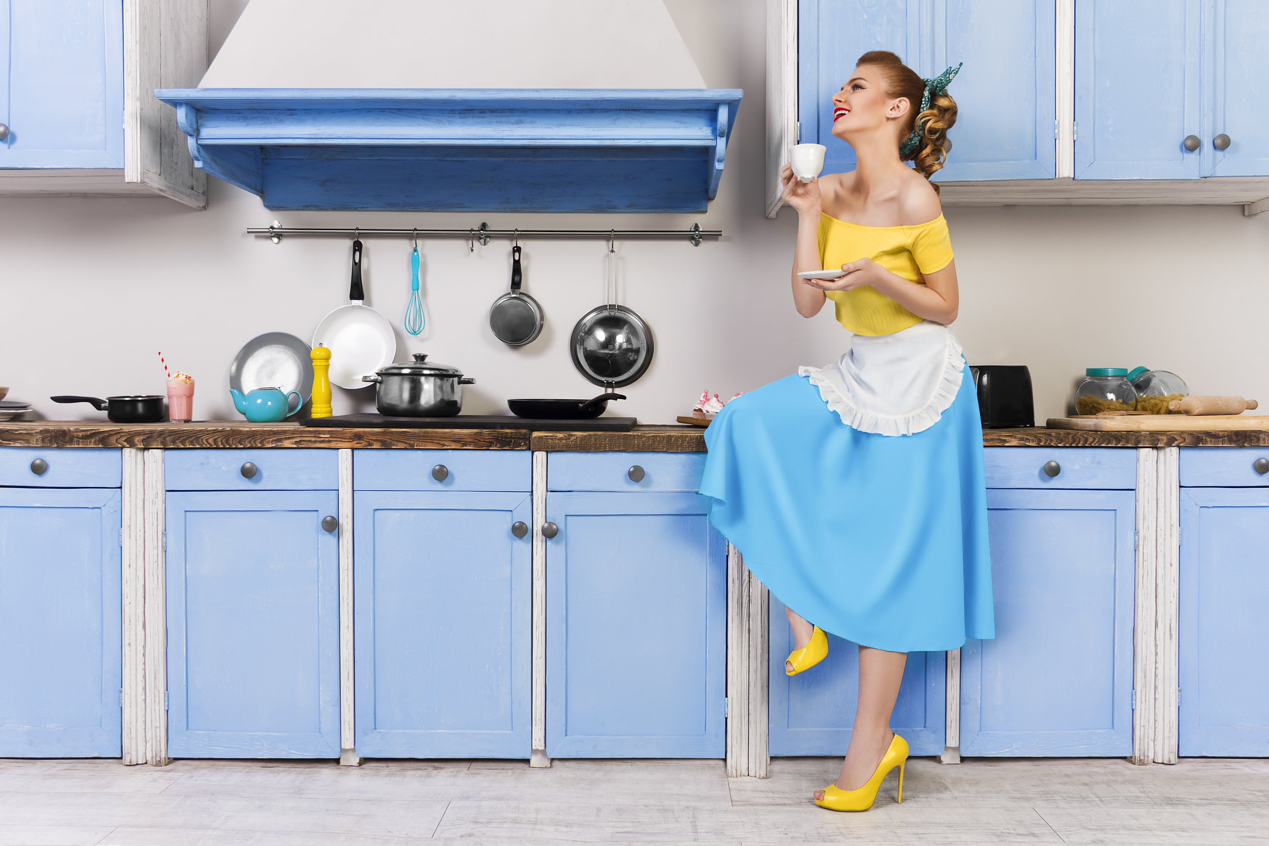
Some notable features and styles for the decade:
Scandinavian furniture
Mid-century modern
Pastel, neon and nature-inspired color schemes
Bold Patterns
Wall-to-wall carpet
Chrome, vinyl, and Formica furniture
1960s
The 1960s is often referred to the defining decade for interior design, among other things. You might walk through a beaded curtain or be mesmerized by a lava lamp, thanks to such influences as the hippie movement.
Textured fabrics, shag carpet, and wood paneling brought a new depth of dimension to designs. Colors were inspired by nature, though turquoise and orange were also popular.

Technological advances and the Space Race meant futuristic furniture designs. Your 1960s home might feature molded plastic chairs in curvy shapes or unusual lamps.
The highlights of the 60s for design:
Textured rugs and fabrics
Futuristic space furniture
Lots of unique lamps
Wood paneling
Wild fabrics, including tie-dye and paisley
1970s
Self-expression through color defined much of the designs of the 70s. Mustard yellow could be found somewhere in almost every home, often accompanied by other bright and bold colors. The bright colors didn’t just grace the walls; you could get wall-to-wall shag carpet in a burnt orange or an olive green.
Rather than the tech and science influences of the 60s, homeowners now looked to nature, using organic lines and forms. As a result, you would find many homemade projects as decor, one of the most popular of which was macrame.

What homeowners couldn’t do without:
Foiled or flocked wallpaper
Floor to ceiling stone fireplaces
Shag rugs and crochet throw blankets
Macrame, often a macrame owl
Environmentally-friendly spaces, often featuring natural light sources
1980s
You might describe the 80s design trends as over-the-top. With its many colors, ranging from pastels to neons, floral patterns, chintz, and lacquered furniture, you’d be right in describing it that way.
Eighties styles brought together geometric shapes, skirted furniture, Southwestern pastel paintings, and multicolored cotton curtains with accompanying valances, creating comfortable living spaces.

New to the decade, open-concept kitchens created more family-focused living spaces. Major themes in decorating schemes included modern, Memphis Design, and art-deco. You might not have to look to the past to see some of these design features, as the 80s have influenced design and fashion on and off for the last decade.
Design features at a glance:
Mirrors and glass-top tables
Houseplants
Curtains with valances - chintz
Bedding featuring shams, dust ruffles and throw pillows
Triangles and pastels
Florals
1990s
Walls were the place of expression in the 90s. Stenciling, sponge painting, and faux finishes, paired with geometric or floral wallpapers, were prevalent in most homes. Adding a bold pop of red, blue, yellow or hunter green offset the often neutral color palette.

Knotty pine furniture and wood cabinets in the kitchen were very popular. If you spent any time in the 90s, you sat in at least one piece of wicker furniture. Another element to these homes designed for comfort was over-long curtains. The longer, the better! You might trip over the draperies that would often be amassed on the floor in a stylish pile.
Other design ideas you may or may not want to revisit from the 90s:
Brass fixtures
Slipcovers
Arched windows
Natural wood kitchen cabinets
Fake plants
Wall decals
2000s
Not unlike in the 1970s, in the 2000s interior design focused on being environmentally friendly. Go green! Literally! Green was often featured on walls or as an accent color. In the theme of going green, you’d see many DIY and recycled projects in home decor. Does anyone have an empty mason ar or bottle vase? These types of containers could be found in many homes.

Whether you lived by the beach or in the middle of the country, nautical-themed decorations abounded. Anchors, seashells, miniature ships, and ropes could be found in living rooms, bathrooms, kitchens, and offices.
The 2000s also included:
Open floor plans
All-white kitchens
Neutral color palettes
Granite countertops
Stainless steel appliances that were more eco-friendly
Today’s Trends
From casual to high-end, designs are available at your fingertips through the global marketplace. Everyone wants to make their home unique using DIY and handmade decorations. Pinterest and Etsy, along with others, opened the doorway for you to become the designer, sometimes to a fault.
It can be tough to navigate through all the tips and tricks put online. That’s when you give Omorfia Designs a call! At Omorfia, we offer a FREE 30-minute phone consultation to help you find the perfect design for your home.
Our goal is to help you make your space beautiful, whether that’s with the latest trends, or if you want to go retro and revisit one of the decades of the past. If 30 minutes isn’t enough time for us to help make your design dreams a reality, we also offer 90 minutes in-person to look more at your space for less than $100.