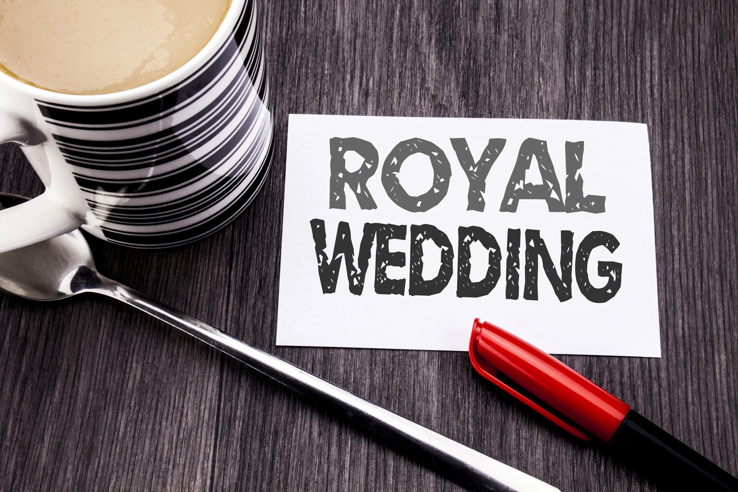
Royal Wedding Colors and U.S. Interior Design Trends Collide
Have you caught yourself watching any of the recent royal weddings? It is hard not to be at least a little bit fascinated by the lavish affairs that are generally broadcast even on our side of the pond. Between the elegant dresses, the incredible floral arrangements, the food, and of course the hats and fascinators, our screens are filled with an array of colors.
Have you caught yourself watching any of the recent royal weddings? It is hard not to be at least a little bit fascinated by the lavish affairs that are generally broadcast even on our side of the pond. Between the elegant dresses, the incredible floral arrangements, the food, and of course the hats and fascinators, our screens are filled with an array of colors.
Is our country influenced by these color choices? How did Kate Middleton’s choices of colors for her wedding affect Americans? Or how about Meghan Markle’s light green arrangements? Or even Princess Beatrice and Eugenie with Eugenie’s recent marriage.
Americans are enamored with the royal lifestyle, so it makes sense that their choices will influence us. Time and again, we have seen colors from a royal affair creep into our fashion and design world. Whatever colors are chosen to adorn the dresses and flowers at royal weddings inevitably invade our walls and wardrobes, too. The experts at Omorfia follow these trends and will help bring these colors into your home.
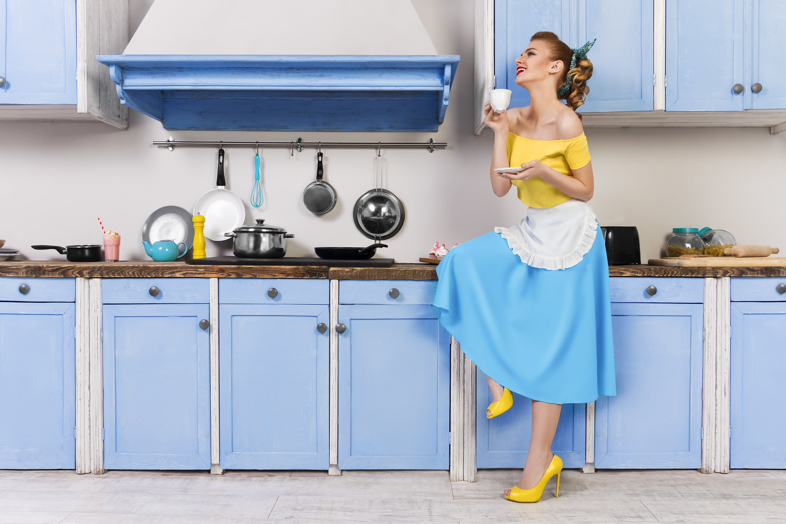
Mint Green Galore
For the 29 million Americans and 53 million people worldwide who tuned in to watch Meghan Markle and Prince Harry tie the knot, the evidence of Meghan’s favorite color was everywhere.
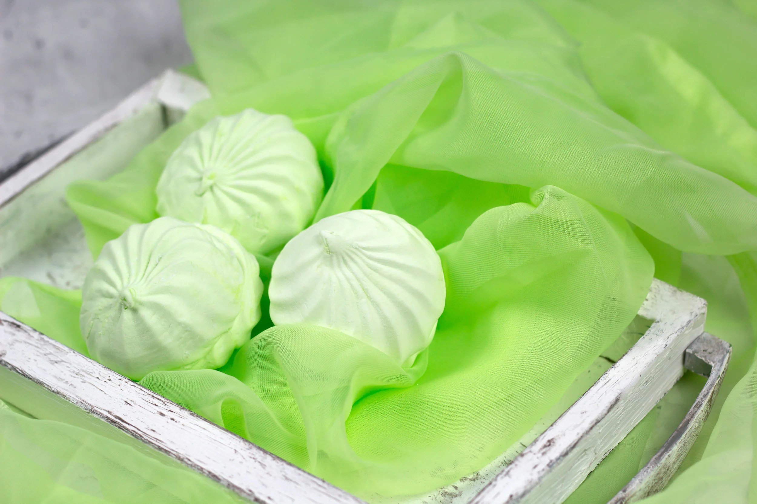
It is no secret Meghan Markle prefers shades of light green, in particular, mint green. It is noticeable in her clothing choices, and the incredibly popular lifestyle blog she used to run is full of her preferences for this soft color.
Pictures from the royal wedding in May showcase all shades of green. Meghan’s mother wore an incredible mint green dress with a matching hat and coat. The Queen herself, who is known for her love of bright colors, even wore a green jacket over her floral dress. Many of the guests were in similar shades of green. Everyone looked fabulous in this calming yet flattering color.
Since the wedding, Americans have seen a drastic rise in the color green across the board. Interior decorators are filling homes and walls with beautiful shades of green. One of the hottest colors of 2018 is light green. This color is an excellent choice because it comes in so many beautiful shades from mint to chartreuse to sage and citron.
It will not be hard to find a way to incorporate light green as there is a shade for everyone. If you are looking for ways to try out light green without painting a wall or buying a new couch, try throw pillows, curtains, vases, artwork, or throw blankets on your couch. Or simply bring in a bouquet filled with soft green or even a live plant.
If you are sold on this appealing color, there are numerous shades of paints from every distributor that will fit the bill. One particular color that will be easy to find is Pearl Gray from Sherwin-Williams. Painting any area of your home, or even painting one wall as an accent, will create a warm and soft feel. Light green is known to be a calming color.
Will Jewel Tones Be Next?
Though not as heavily publicized or followed, Princess Eugenie is another royal who also had a royal wedding this year. Princess Eugenie is the daughter of Prince Andrew, the third child of Queen Elizabeth and Prince Edward, and Sarah, Duchess of York, though the world knows her as Fergie.
Princess Eugenie is not a “working royal,” meaning she does not perform daily duties for the queen. She is not close in line for the throne; she is ninth in line, so she has fewer responsibilities. That doesn’t stop people all over the world from being fascinated with her and her wedding.
The princess married Jack Brooksbank in October. Jack is a small celebrity himself since he works for the alcohol brand started by George Clooney and Rande Gerber. Many well-known celebrities attended their wedding, including George and Amal Clooney, David and Victoria Beckham, Liv Tyler, Naomi Campbell, and Kate Moss; Andrea Bocelli even performed!
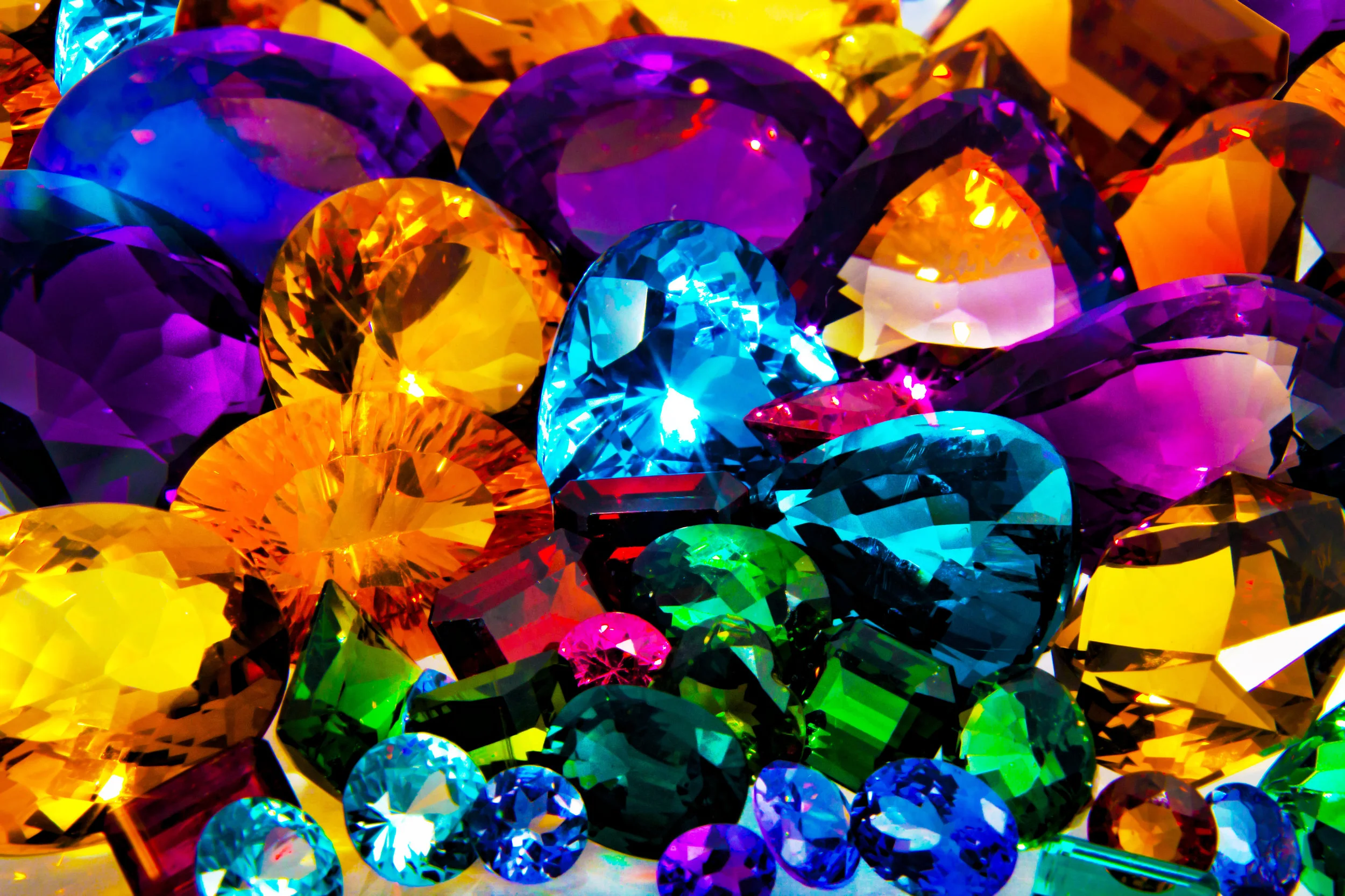
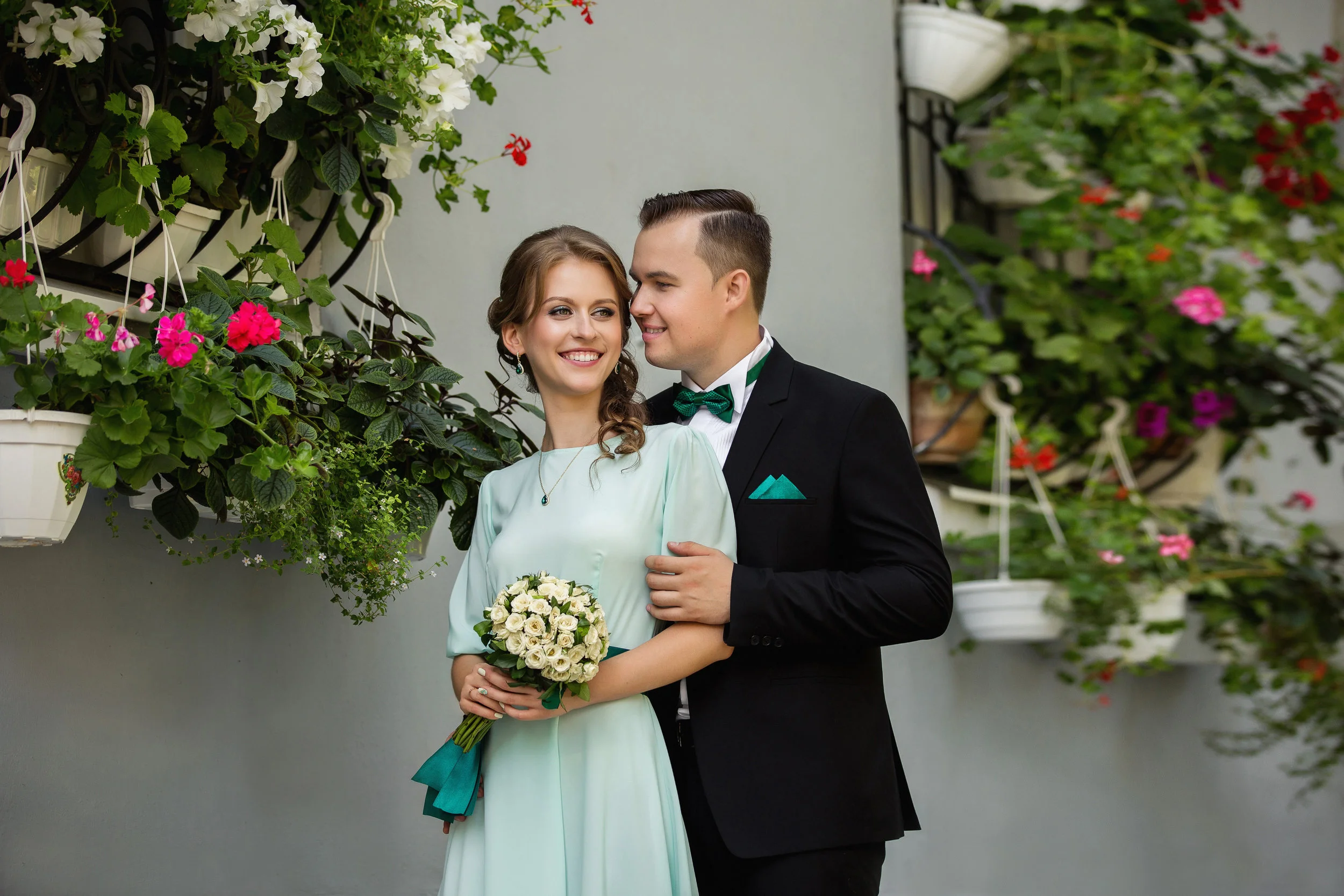
Even amidst all these celebrities, it was hard to miss the prevalence of jewel tones everywhere. Across the board deep blues, vibrant greens, and beautiful reds adorned dresses, flowers, and decoration. Emeralds, rubies, and sapphires were called to mind as we watched guest after guest come and go from this lavish affair. Princess Eugenie even borrowed a tiara for her special day filled with incredible emeralds from The Queen.
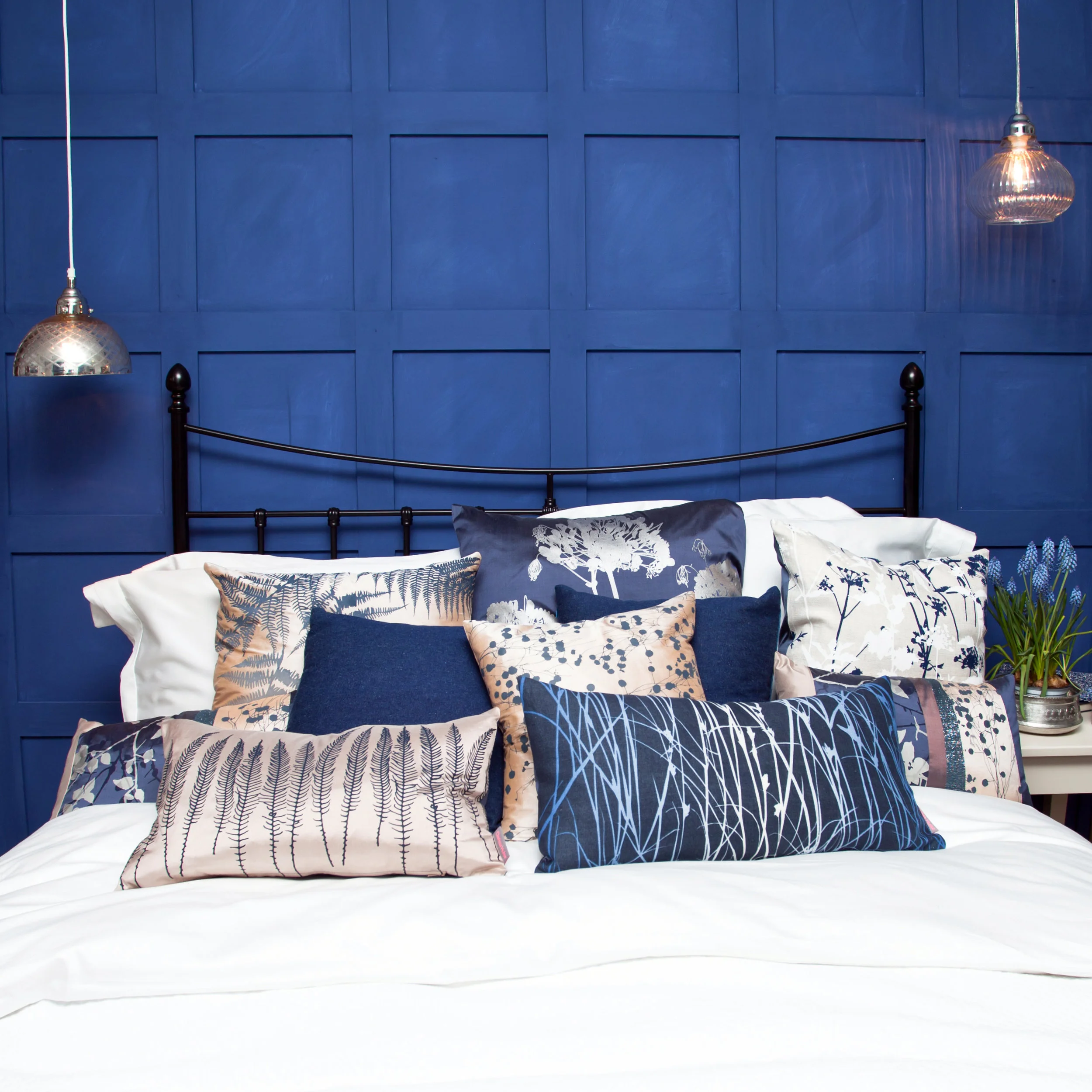
Will we start seeing rich jewel tones in paint colors coming out in the next year? When we go shopping for a cocktail dress to a holiday party will we see lots of deep reds, blues, and greens? Jewel tones are incredibly beautiful and bold. Most people wouldn’t mind picking from these beautiful hues.
Princess Beatrice is the older sister of Princess Eugenie. Though not currently dating anyone, it is fun to surmise what another royal wedding might bring. What colors will she choose? What will the guests wear? Will we see these colors creeping across the pond and into our homes the following few months?
We can only assume that it will be a lavish affair that people all over the world will be interested in and take time out of their schedules to watch. Royal weddings, though not a regular occurrence, have quite the effect on the world around them.
In Conclusion
If you have been inspired by either of the recent royal weddings and want to incorporate those colors into your home, call the experts at Omorfia. They will meet with you and together make a plan on how to bring the beauty of the royal weddings into your everyday life.
Omorfia is the word for beauty in the Greek language. Let them help you. If you call them now, you can schedule a 90-minute consultation for $99.00. Or, if you are on the fence, they will speak with you for 30 minutes on the phone for free. After hearing their ideas and how they can incorporate these beautiful colors into your home, you will want to hear more! Check them out today.
Top Interior Design Trends Throughout History
Interior design is an ever-changing thing. When you look at homes today, you might think that the decor is unique to this time, but looking back at past trends reveals that each decade has some influences from the past.
Top Interior Design Trends
Interior design is an ever-changing thing. When you look at homes today, you might think that the decor is unique to this time, but looking back at past trends reveals that each decade has some influences from the past.
Here are some highlights from the 1940s right on through to today to help inspire your own design ideas.
1940s
The second half of the decade, post World War II, brought new innovations and bright colors into the home. Contrasting the muted colors and industrial look of the 30s, you found bold floral fabrics and wallpapers, bright colors, and curved lines defining the 1940s home designs.
The modernist movement brought a demand in homes’ decor to have style and function. A fold-down countertop or hidden compartment, paired with linoleum flooring, would be a common find in a 40s kitchen.
A few highlights of the popular trends:
Floral and gingham fabrics/patterns
Wooden furniture
Linoleum floors
Coordinated color schemes
Curved lines
Wallpaper in bright and bold designs and colors
1950s
While the 40s had bold and bright colors, the 50s toned things down with pastels, usually pink, mint green, blue or yellow. The patterns and fabrics of the era were influenced by science and space exploration. You could have stars, stripes, fruit, or galaxies on your walls, tablecloths, or sofas.
The influence of Charles Eames on furniture design brought curved, and clean chrome and vinyl furniture. Anyone for a banana-shaped coffee table? Whatever the colors or schemes you might find, there was great emphasis on function, and comfort for leisure activities.
Some notable features and styles for the decade:
Scandinavian furniture
Mid-century modern
Pastel, neon and nature-inspired color schemes
Bold Patterns
Wall-to-wall carpet
Chrome, vinyl, and Formica furniture
1960s
The 1960s is often referred to the defining decade for interior design, among other things. You might walk through a beaded curtain or be mesmerized by a lava lamp, thanks to such influences as the hippie movement.
Textured fabrics, shag carpet, and wood paneling brought a new depth of dimension to designs. Colors were inspired by nature, though turquoise and orange were also popular.

Technological advances and the Space Race meant futuristic furniture designs. Your 1960s home might feature molded plastic chairs in curvy shapes or unusual lamps.
The highlights of the 60s for design:
Textured rugs and fabrics
Futuristic space furniture
Lots of unique lamps
Wood paneling
Wild fabrics, including tie-dye and paisley
1970s
Self-expression through color defined much of the designs of the 70s. Mustard yellow could be found somewhere in almost every home, often accompanied by other bright and bold colors. The bright colors didn’t just grace the walls; you could get wall-to-wall shag carpet in a burnt orange or an olive green.
Rather than the tech and science influences of the 60s, homeowners now looked to nature, using organic lines and forms. As a result, you would find many homemade projects as decor, one of the most popular of which was macrame.

What homeowners couldn’t do without:
Foiled or flocked wallpaper
Floor to ceiling stone fireplaces
Shag rugs and crochet throw blankets
Macrame, often a macrame owl
Environmentally-friendly spaces, often featuring natural light sources
1980s
You might describe the 80s design trends as over-the-top. With its many colors, ranging from pastels to neons, floral patterns, chintz, and lacquered furniture, you’d be right in describing it that way.
Eighties styles brought together geometric shapes, skirted furniture, Southwestern pastel paintings, and multicolored cotton curtains with accompanying valances, creating comfortable living spaces.

New to the decade, open-concept kitchens created more family-focused living spaces. Major themes in decorating schemes included modern, Memphis Design, and art-deco. You might not have to look to the past to see some of these design features, as the 80s have influenced design and fashion on and off for the last decade.
Design features at a glance:
Mirrors and glass-top tables
Houseplants
Curtains with valances - chintz
Bedding featuring shams, dust ruffles and throw pillows
Triangles and pastels
Florals
1990s
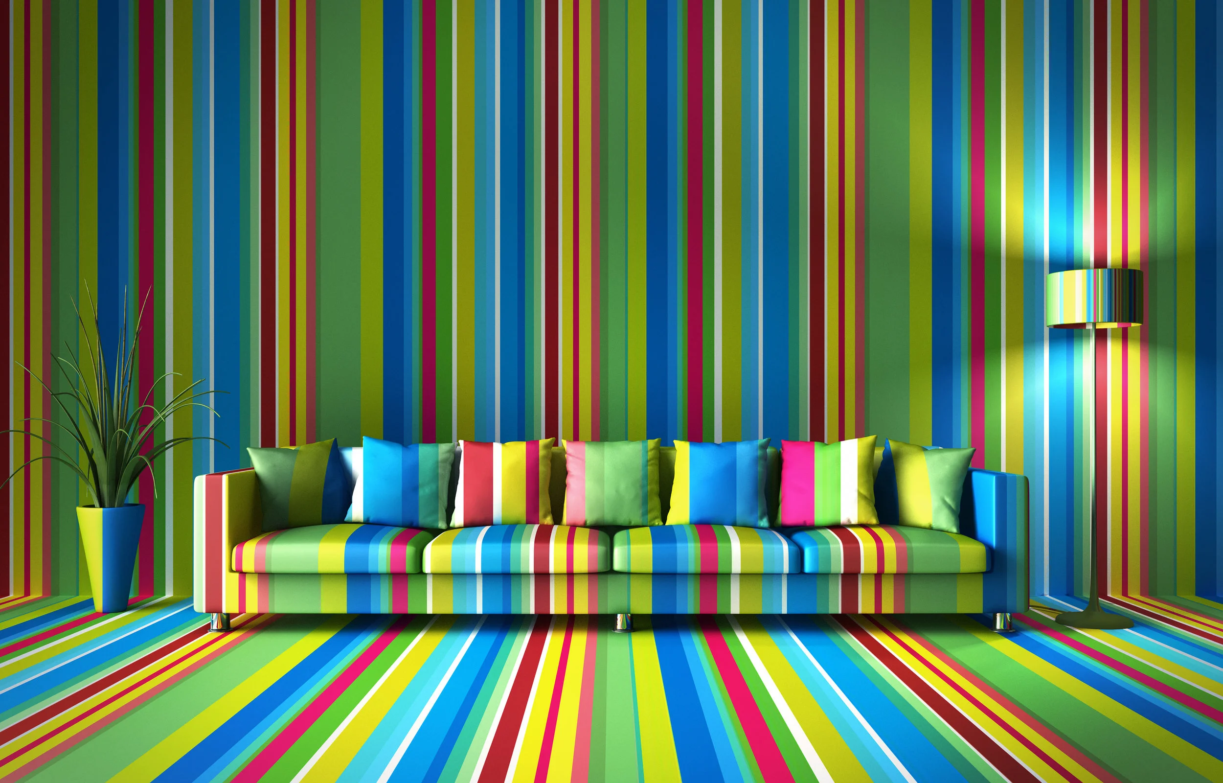
Walls were the place of expression in the 90s. Stenciling, sponge painting, and faux finishes, paired with geometric or floral wallpapers, were prevalent in most homes. Adding a bold pop of red, blue, yellow or hunter green offset the often neutral color palette.

Knotty pine furniture and wood cabinets in the kitchen were very popular. If you spent any time in the 90s, you sat in at least one piece of wicker furniture. Another element to these homes designed for comfort was over-long curtains. The longer, the better! You might trip over the draperies that would often be amassed on the floor in a stylish pile.
Other design ideas you may or may not want to revisit from the 90s:
Brass fixtures
Slipcovers
Arched windows
Natural wood kitchen cabinets
Fake plants
Wall decals
2000s
Not unlike in the 1970s, in the 2000s interior design focused on being environmentally friendly. Go green! Literally! Green was often featured on walls or as an accent color. In the theme of going green, you’d see many DIY and recycled projects in home decor. Does anyone have an empty mason ar or bottle vase? These types of containers could be found in many homes.

Whether you lived by the beach or in the middle of the country, nautical-themed decorations abounded. Anchors, seashells, miniature ships, and ropes could be found in living rooms, bathrooms, kitchens, and offices.
The 2000s also included:
Open floor plans
All-white kitchens
Neutral color palettes
Granite countertops
Stainless steel appliances that were more eco-friendly
Today’s Trends
From casual to high-end, designs are available at your fingertips through the global marketplace. Everyone wants to make their home unique using DIY and handmade decorations. Pinterest and Etsy, along with others, opened the doorway for you to become the designer, sometimes to a fault.
It can be tough to navigate through all the tips and tricks put online. That’s when you give Omorfia Designs a call! At Omorfia, we offer a FREE 30-minute phone consultation to help you find the perfect design for your home.
Our goal is to help you make your space beautiful, whether that’s with the latest trends, or if you want to go retro and revisit one of the decades of the past. If 30 minutes isn’t enough time for us to help make your design dreams a reality, we also offer 90 minutes in-person to look more at your space for less than $100.